Notefile for Mac take 2

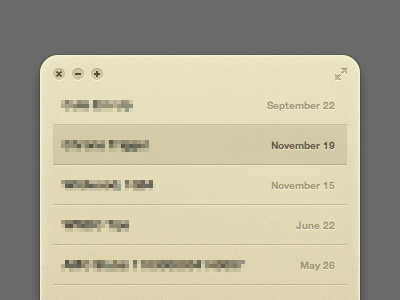
I'm not sure if this is final yet, but I decided to tweak the window design for the Notefile Mac app I've been working on. The more I polished the design, the more apparent it became that the previous design wasn't quite working. There were two main problems:
• If you scrolled down, the text at the top just kind of looked cut off. Because of the buttons at the top, I couldn't set it up the same way I set up the iOS app and widget. I needed something for the text to scroll up underneath.
• I set up the window so you can drag it from any "empty" area. This doesn't work as well as it does with a widget though, and it was hard even for me to tell where you could actually drag from. With a visual bar along the top, it's much nicer—you have an area to aim for.
So I tried to come up with something that's a little more like a standard Mac app, but still looks like Notefile.
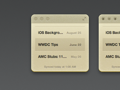
This screenshot shows the app at its tiniest size possible. At smaller sizes it'll work like the iPhone app or widget. If you expand it to a large enough size, it'll split into a two pane view, more like the iPad version.
Anyway. I'm digging this now, but we'll see how much I hate it on Monday.