Find designers
Designer search
Quickly find your next designer
Post a job
The #1 job board for design talent
Inspiration
Courses
UX Diploma
Learn UX design from scratch in 6 months
UI Certificate
12-week UI skill building for designers
Live interactive workshops
with design professionals
Jobs
Go Pro
Log in
Dribbble: the community for graphic design
Log in
Sign up
Rebound
Nuno Loureiro
Follow
Following
Like
#F6F2EB
#151514
#E8E1B5
#5BBFE2
#4C4D4D
#ADAEAF
#CD4F28
#DF8A6A
Download color palette
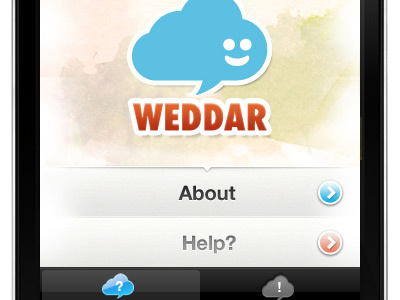
maybe something more like this....
Rebound of
Weddar iPhone App Shot1
By
Catarino
iphone
type
ui
View all tags
Posted on Sep 21, 2010
350
1
1
8
View feedback
Nuno Loureiro
More by Nuno Loureiro
View profile
Previous
Next
Loading…