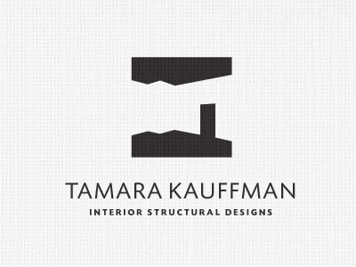
Tamara Kauffman Interior Designs Logo

Revisting this logo after some time sitting with it with the client. After I did a logo process post on this a few weeks back, It was apparent that some people were not seeing the intended 'room' straight away.
Fortunately, the client has not been in a rush either, so when I approached her about these other perceptions, she agree it would be nice to see if we could play with it a bit more.
The main problem with the original I think was the 'door', this was looking too much like a chimney on a angled roof, with a dark sky above. I didn't see this at first, now it's quite apparent.
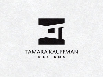
So the trick was to make it more door like, so having one slightly ajar I felt removed the chimney aspect, then adding a window I feel also helps remove the 'roof' perception. Also, the original door seemed too small in relation to the top of the ceiling, so have made the door bigger, with a more natural gap between top of door and ceiling.
But I am so close to this mark, it's hard for me to be really subjective. So please do offer up any thoughts on this.
Side by side comparison
Do you see a room or something else? I am not too bothered about people not 'getting it' immediately, that's all part of a logo being remembered. What I want is to avoid totally different perceptions.