Homepage v1

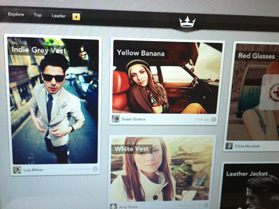

Here is the over all looks of the site. Instead using the initial brief where the logo should be put on the left I took another approach to place the logo centered and using another shape above it. I think it looks better with the logo.
I also change the menubar icon, placements and style.
-------
Please check the actual pixel here.
Any thoughts?
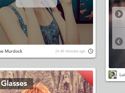
Note: the starred mask is misplaced there. Sorry for that :P