Find designers
Designer search
Quickly find your next designer
Post a job
The #1 job board for design talent
Inspiration
Courses
UX Diploma
Learn UX design from scratch in 6 months
UI Certificate
12-week UI skill building for designers
Live interactive workshops
with design professionals
Jobs
Go Pro
Log in
Dribbble: the community for graphic design
Log in
Sign up
Next Prev → / ←
Bady
Available for work
Follow
Following
Like
Get in touch
#E8E9E9
#AAA098
#242225
#9B6E62
#A48D76
#504C4F
#D0B197
#6C8577
Download color palette
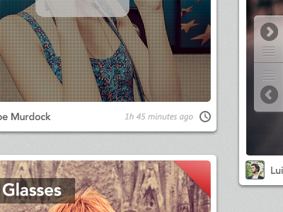
First project in 2012. A bit late, but still lot of fun :)
Bigger preview
.
app
button
design
fashion
gallery
gui
homepage
icon
menu bar
navigation
next
picture
preview
time
ui
web
zoom
View all tags
Posted on Jan 20, 2012
17,108
36
212
8
View feedback
Bady
Get in touch
More by Bady
View profile
Previous
Next
Loading…
Loading…
Loading…