Dashboard Revisions — Take 2

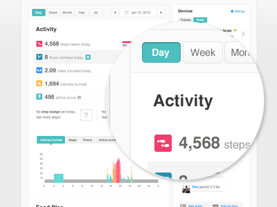
Taking one step back and trying to maintain the current layout we have. Also working on couple new features that will be released later this month or so. Let me know what you think.
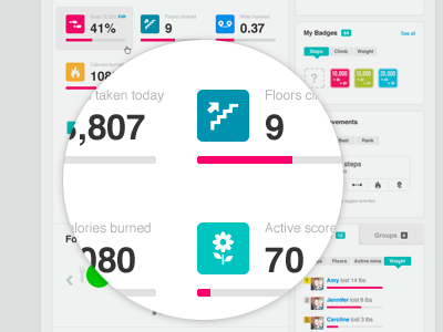
Taking one step back and trying to maintain the current layout we have. Also working on couple new features that will be released later this month or so. Let me know what you think.


