Kerem

Dashboard Revisions

Dashboard-revisions

33 Responses (page 1 of 2)

  1. Pro Kerem Kerem Suer

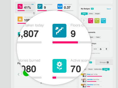
    I'm currently working on our dashboard revisions, trying to simplify the layout, clean out and unify some of the UI patterns which was a long over due. A lot more to come.

    likes

    5 months ago

  2. Userpic Tony Webster

    Love this! Feels cleaner and more actionable, and I like the tabs on the bottom right too.

    5 months ago

  3. Pro Ooykun Oykun Yilmaz

    Loving the colors and great use of white space! I would love to see the whole thing in actual size... Are you designing the icons? the flower is so pretty!

    likes

    5 months ago

  4. Pro Me Hunter Hastings

    Love the simplicity & color choices.

    5 months ago

  5. Pro Luxe-13_o Aaron De Simone

    Nice work - your UI makes me want to buy a FitBit.

    likes

    5 months ago

  6. Pro Curious me Anthony Lagoon

    As a new user. I'm going to complain that you are changing it. Even though I'm not really familiar with it yet… I'm "that guy" that hates change.
    j/k Looks great! Love how clean it is.

    likes

    5 months ago

  7. Pro For dr Eric Hoffman

    This is crap...

    likes

    5 months ago

  8. Pro Kerem Kerem Suer

    Thanks guys.
    @oykun icons are mostly designed by my awesome coworkers Mark Bult and Caroline Wiryadinata.

    @Aaron you probably should buy a Fitbit then :)

    @Anthony Thanks dude, just so you know, it's not THAT different :)

    5 months ago

  9. Pro Untitled-2 Mani

    simple and nice :)

    5 months ago

  10. Pro Rocket-64x64 Alex Pankratov

    Well hello there, Fitbit designer.

    Any plans to make it possible to remove unused tiles from the dashboard? For example, I am not logging my food, so I don't really want to see "Food Goal" section. Nor do I care about the "Journal" part. The same goes for "My Groups". What I do miss though is a "Weight" tile and a way to log today's weight directly from the dashboard.

    Oh, and a toned-down version would've been extra nice. You know, I am not a teenage girl who is easy to motivate with an excess of bright colors. Even your own illustration silhouettes are leaving the dashboard, they just can't take it anymore there :)

    Great stuff though regardless. Totally worth $100.

    PS. Oh, and one last thing. How come there are no Sleep graphs in the iPhone app? This is arguably the most important graph to have on the phone, because that's the first thing I'd like to look at when I wake up in the morning.

    likes

    5 months ago

  11. Juju-05 Julien Coppola

    Very cool, i love the colors.

    5 months ago

  12. Pro Kerem Kerem Suer

    Alex,

    Thanks so much for the feedback. It's always refreshing to see a fellow designer who's also a Fitbit user give feedback, makes it extra valuable. Draggable tiles are definitely something we're considering, but as you might imagine creating such dynamic structure is not the easiest when you don't already have that foundation in your framework. We want to and like to do stuff the right way, so I would say definitely keep tuned on that one. Weight section will get some love as well, CES attendees got a sneak peek while checking out our new Wi-Fi scale Aria yesterday.

    Regarding the sleep graphs in the iPhone app, that's also something we're considering. Overall, we have some exciting stuff coming up. I'm glad you're enjoying your Fitbit tracker, it means a lot.

    likes

    5 months ago

  13. Pro Photo Adam Whitcroft

    Very nice Kerem! I love the palette you're going with, very vibrant and energetic :)

    5 months ago

  14. Dexteravatar Stratos Iordanidis

    Lovely icons! Great colors :)

    5 months ago

  15. Pro Rocket-64x64 Alex Pankratov

    Kerem, dude... Aria. It is very impressive how well thought out it is. That's a stellar product designer/s you have on board.

    When is Aria coming out?

    likes

    5 months ago

  16. Pro Kerem Kerem Suer

    Alex, thanks man. Aria ships late April. And it's product page, and all of our product pages were lovingly hand-crafted by Mark.

    5 months ago

  17. Pro Fucktits Luke Beard

    Hot

    5 months ago

  18. Eightbit-2875e553-fd4c-413e-84fa-5405e0832174_reasonably_small Facundo Gonzalez

    Nice!

    This icon is a bit blurry, you can try re-adjusting it on the grid.

    5 months ago

  19. Logo Mike Scriber

    I'm a huge fan of your work, another great shot.

    5 months ago

  20. Avatar_teevio Stephen Hallgren

    I'm really digging this and can't wait for the new interface!

    5 months ago

  21. Pro Avatar Mike Bernardo

    Awesome. Can't wait to see it live.

    5 months ago

  22. Pro 000bd2d_normal Nate Dicken

    Awesome colors. love it!

    5 months ago

  23. Pro Ryan Ryan Le Roux

    Excited for these.

    5 months ago

  24. Brad-1 Bradley Castaneda

    Colors are superb.

    5 months ago

  25. Pro Logo Julien Renvoye

    Nice kerem. Nice.

    5 months ago

keyboard shortcuts: previous shot next shot L or F like