Paperclip Type

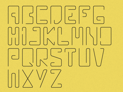
After some very helpful feedback I've improved the letter I which now ties in better with the overall feel of the typeface.
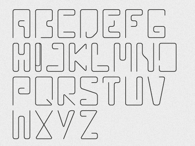
After some very helpful feedback I've improved the letter I which now ties in better with the overall feel of the typeface.


