H-gravatar

Paperclip Type

Paperclip-type-dribbble-01

6 Responses

  1. Pro H-gravatar Heinrich Ferreira

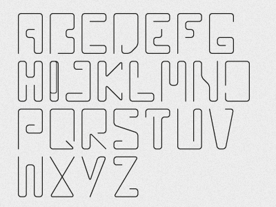
    A paperclip inspired typeface I've been developing on and off for a while. I'd still like to produce a set of numerals and lower case letters too.

    Feedback always appreciated!

    5 months ago

  2. Pro 45059_152308224796052_100000506264742_408232_2941299_n (1) Siddharth Arun

    Looks great! Awesome idea...

    likes

    5 months ago

  3. Pro Evan-square_fc_fn Evan MacDonald

    The letter "I" is the only letter that feels out of place (simply because of the overlap). But it's the letter that should look like a paperclip!

    likes

    5 months ago

  4. Pro Asset-dribbble Rich Baird

    That's a pretty solid observation Evan and would agree.

    likes

    5 months ago

  5. Pro H-gravatar Heinrich Ferreira

    You're right Evan! It does look out of place. I'll need to fix that. Thanks for pointing that out!

    likes

    5 months ago

  6. H-gravatar

    After some very helpful feedback I've improved the letter I which now ties in better with the overall feel of the typeface.

    5 months ago

keyboard shortcuts: previous shot next shot L or F like