Untitled-1

Theme Builder v2 Rebound

29 Responses (page 1 of 2)

  1. Pro Untitled-1 Jeff Broderick

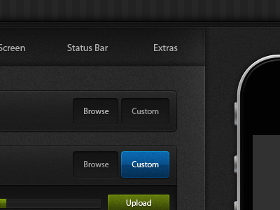
    Here is a modified version with the noise brought way down and removed from the buttons/progress bar. What do you think?

    almost 2 years ago

  2. Pro Mtn_rogie Rogie

    Needs more noise ;)

    LOL, just kidding. DRASTIC improvements. Great job.

    likes

    almost 2 years ago

  3. Pro Untitled-1 Jeff Broderick

    I was about to kill you!

    likes

    almost 2 years ago

  4. Pro Pic Benjamin De Cock

    Way better indeed :)

    almost 2 years ago

  5. Pro Photo-200 Robbie Pearce

    Much much better! Love it, excellent mix of noiseyness and shinyness (I got all the technical terms over here).

    Green button looks a little muddy though :)

    likes

    almost 2 years ago

  6. Looking-up Sam Vermette

    Yep, looking much better. What kind of theme builder is this? Jailbroken devices?

    almost 2 years ago

  7. Pro Untitled-1 Jeff Broderick

    Thanks guys!

    @Sam Yessir. Not sure if I can share the link yet. But let me know if you are interested and I will let you know more details when I know. :D

    almost 2 years ago

  8. Pro Dsc_4492_small_filtered Daniel Waldron

    This is looking much better. It was a good design to begin with, but the changes you made, made it great!

    almost 2 years ago

  9. Pro Ryan-rushing Ryan Rushing

    You nailed the 'custom' and 'upload' buttons.

    almost 2 years ago

  10. Avatar2 Anthony Garand

    Amazing! Though I would bump up the noise a tad everywhere except the buttons and shiny things. <- seriously. Cuz it's your style.

    likes

    almost 2 years ago

  11. Pro Avatar Skylar Hartman

    less noise on the buttons = Good change.

    almost 2 years ago

  12. Twitter-avatar Jeff Batterton

    That's gorgeous bro!

    almost 2 years ago

  13. Pro Badge Andrew Johnson

    could use some more noise..j/k. looks awesome man.

    almost 2 years ago

  14. Pro Matthewsanders2 Matthew Sanders

    Why the decision to use the old gloss look, only more harsh? Everything else looks great.

    likes

    almost 2 years ago

  15. Square-big Manolo Sañudo

    heck of a ton better. Great job! :D

    almost 2 years ago

  16. Pro Smaller_headshot Bryan Le

    Very cool! I love it. Not a HUGE fan of the overly glossy look though. I'm also curious - with such a muted background/interface, the buttons and images must pop a lot ... in which case, I think the buttons don't need to be so bright, and let the content/images do the popping.

    almost 2 years ago

  17. Pro Photo Corey Haggard

    What about no noise that is on the inactive states, or the browse buttons?

    almost 2 years ago

  18. Pro Miro_guitarist Miro Keller

    I agree with Robbie Pearce, that green button would benefit of being a bit more saturated and vivid.... Otherwise, flawless!!!

    almost 2 years ago

  19. Pro Screen_shot_2010-07-06_at_1 Trav

    Dude this looks fantastic. I dig the contrast between shiny/noisy. The high-gloss thing has been done a bunch before but it looks so fresh here. I wouldn't change a thing.

    almost 2 years ago

  20. 80x80 Peter

    This is serious amount of work and I’m far from this level of precision, but I’ve gotta say… buttons look like Vista (see here), not sure if it’s what you wanted for an iPhone app.

    likes

    almost 2 years ago

  21. Pro Photo Corey Haggard

    I think they look a butt load better than any windows product lol

    almost 2 years ago

  22. Joffrey Joffrey

    Stunning.

    almost 2 years ago

  23. 180_180 Thomas Maier

    That glow always reminds me of Windows Vista. Maybe I’m wrong but it does. :P

    almost 2 years ago

  24. Pro Gedy Gedy Rivera

    Awesome stuff Jeff.

    almost 2 years ago

  25. Pro Avatrara Alex Penny

    This does look a lot better!

    almost 2 years ago

keyboard shortcuts: previous shot next shot L or F like