Consume 2’s scrubber and graphs

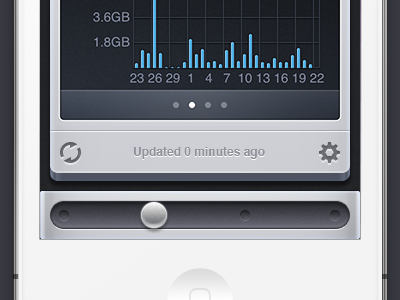
A preview of Consume 2, showing graphs and the scrubber.
Previous versions of Consume used page indicators and swiping left and right to navigate between accounts. As we added more providers, customers were able to use app for more and more things. Swiping left and right to change the view was fine for less than four accounts, but not good enough when there was more.
Our solution was to maintain the left and right swiping ability, but to replace the page indicators at the bottom of the screen with a scrubber. This has lots of advantages: You can tap anywhere along the scrubber to jump directly to an account, or you can grab the handle and slide it around to move between accounts, and see a preview while doing so.
We’ll be submitting Consume 2 to the App Store in the next few days. Consume 2 is a free update for Consume 1 owners.
Edit: Consume 2 has been released! http://bjango.com/ios/consume/