Find designers
Designer search
Quickly find your next designer
Post a job
The #1 job board for design talent
Inspiration
Courses
UX Diploma
Learn UX design from scratch in 6 months
UI Certificate
12-week UI skill building for designers
Live interactive workshops
with design professionals
Jobs
Go Pro
Log in
Dribbble: the community for graphic design
Log in
Sign up
Consume welcome icon
Marc Edwards ✎ Bjango
Follow
Following
Like
#2C2D32
#3B3C43
#4BCAF6
#32A8DF
#D83311
#4A3645
#5E8AAA
Download color palette
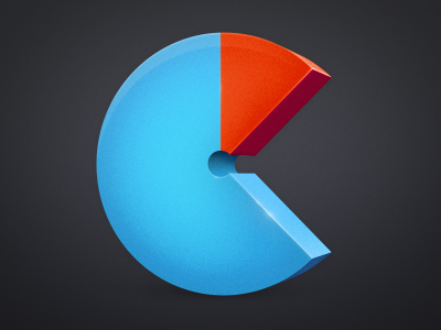
Another take on the Consume icon. This one's being used on the app's welcome screen.
Rebound of
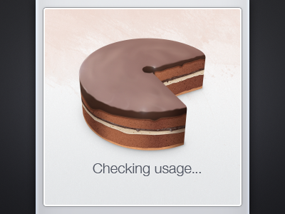
Some more cake
By
Marc Edwards ✎ Bjango
blue
consume
icon
ios
ipad
iphone
red
usage
View all tags
Posted on Jul 8, 2011
6,744
9
128
6
View feedback
Marc Edwards ✎ Bjango
Makers of Snowflake, iStat Menus, and Skala.
More by Marc Edwards ✎ Bjango
View profile
Previous
Next
Loading…