Si-tn

Carts

Carts

7 Responses

  1. Pro Si-tn Shaun Inman

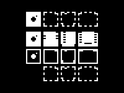
    I think the HUD needs something a little more iconic for the 2-, 4-, 8-, and 16-bit resolution indicators. I'm not sure the it needs anymore numbers crammed in it.

    So I'm toying with the idea of using the shape of the equivalent Nintendo cartridge to represent each resolution (with a floppy for 2-bit since all the carts preceding the NES were just non-descript rectangles).

    While not as strong conceptually as the DIPs I was initially considering I think these carts lack the nerdiness and numerical baggage of the alternatives and as a result are stronger visually and cognitively.

    Or maybe not, maybe these are just easter egg icons.

    over 2 years ago

  2. Dsc_0112_bigger D. Keith Robinson

    I like the idea, but, honestly, I never would have sussed that out without your explanation. Not that I've got a better idea for you. It's a tough one.

    over 2 years ago

  3. Pro Si-tn Shaun Inman

    I'm not sure immediate understanding is necessary. First time you see a mushroom in a Mario game (and I mean the absolute first time) how do you know what it does? You don't until you experience it (or you read the manual or someone tells you).

    When you get the thing that looks like a Gameboy cartridge and you get bigger and the screen turns green it won't really matter if you recognize the icon for what it is--as long as you associate the effect with the cause. Whenever you get or select that icon the screen will turn green and if you're small you'll turn big.

    over 2 years ago

  4. Dribbble Marty Alchin

    Personally, I think it'd be best to have each icon be representative of the environment, so the 2-bit would be black and white, while the 16-bit would be hi-color. Basically just some sort of wave pattern or something that can get progressively richer. It might be weird having a 16-bit-styled icon even on a 2-bit screen, but it seems like it'd be more representative of the way the different modes actually behave.

    over 2 years ago

  5. Pro 1003-tim Tim Brown

    Well, I like these much better than numbers in the context of the HUD. The NES/SNES icons are awesome.

    over 2 years ago

  6. Pro Dc-2012 Dan Cederholm

    Liking this concept better than the DIPs. It'd be a bonus to eventually figure out they're old school carts.

    over 2 years ago

  7. Si-tn

    Stumbled upon the Magnavox Odyssey yesterday. The world's first home console was cartridge-based and black and white. Perfect for Mimeo's 2-bit RAM cart.

    And just in case Rich doesn't have anything better to do, I thought I'd toss in one of the animated 2-bit bits Mimeo must collect. I never Dribbbled the original version but the orbiting bits made it way too busy once you got a few on screen at once.

    Lastly I recorded a new blurry video showing off the previous level populated with bits and grimps.

    over 2 years ago

keyboard shortcuts: previous shot next shot L or F like