Avatar

Navigation Refined

30 Responses (page 1 of 2)

  1. Avatar Asher

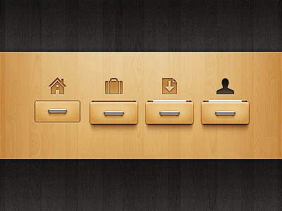
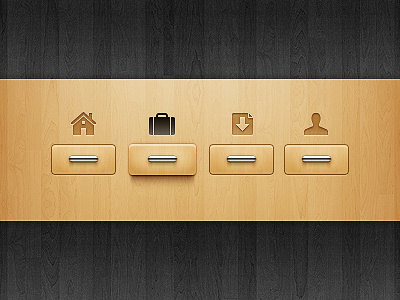
    Here's a improved version of navigation I did a while ago.The four drawers show four states: inactive, hover, clicked and active.I selected the opened drawer for hover state because I thought it would make the action a lot more fun.

    Most of the changes are subtle and you might need to compare this with the old version to find the difference.You can check this animation to observe closely.In short, I made these changes:

    1. Two more states are added
    2. Depth is added to the opened drawer.
    3. Handles are improved (chrome and shadow).
    4. Icons are crisper and better aligned.
    5. Radius of the drawer is reduced by 2px.
    6. Drawers are sharper.

    I hope you like the changes.

    Edit: Just fixed the home icon.Check the animation.

    9 months ago

  2. Pro 10417_100356933317855_100000306455159_6279_3465843_n Sven Read

    Love these awesome wood textures...

    likes

    9 months ago

  3. Pro Tiger-2 Dylan W.

    definitely looks delicious.

    9 months ago

  4. Pro Av Umar Irshad

    Great work Asher.

    9 months ago

  5. Ken Edi Gil

    This is beautiful. Good work.

    9 months ago

  6. Pro 3f6bfe56a32e11e1a9f71231382044a1_7 zee7 ✽

    nicely done dude!

    9 months ago

  7. Pro Bucketicon Chris Farina

    Sick!

    9 months ago

  8. Fotito Juan Gomez

    what's the white thing ?

    def looks better now.

    likes

    9 months ago

  9. Pro Pandadribbble Igor Garybaldi

    — I cant understand too, what is the white thing? Looks nice. Much better than previous version.

    likes

    9 months ago

  10. 128px_avatar_square Natalie Nash

    Such a unique idea and excellently executed.

    9 months ago

  11. Pro Dribbble Cuberto

    love the icons over the boxes and you added contrast? ... it's better

    9 months ago

  12. Avatar Asher

    Thanks everyone for the lovely comments.

    @Juan Gomez: That white thing is supposed to look like a paper :).I wanted to show something sticking out from the drawer.There were many options beside paper but I realized they were all too distracting.

    9 months ago

  13. Pro Wolf-eat-wolf-1 Mark Kemp

    is this thing live on the web anywhere at all? Such immaculate detail... Thanks for the inspiration, dude!

    likes

    9 months ago

  14. Pro Sumo av Nigel Evans

    I can't wait for you to finally put this up live man :)

    likes

    9 months ago

  15. Pro Photo_on_2011-07-07_at_21 Joao Pires

    Amazing style! Love the lightness!

    9 months ago

  16. Pro Self-pic Andrew Newhouse

    Amazing!

    9 months ago

  17. Pro Mason6 Mason Yarnell

    Love it

    9 months ago

  18. Pro Nmxppp Najim

    Amazing work!

    9 months ago

  19. Pro Avatardefault_256_copie Xavier Veyrat

    Oh mon dieu!

    9 months ago

  20. Pro Curious me Anthony Lagoon

    I love the polish! great job!

    9 months ago

  21. Pro Photo Artem Lapitski

    Really nice

    9 months ago

  22. Ava_dribbble Andrey

    good job man!

    9 months ago

  23. Pro 00 Foan82

    Love this. Congrats! :)

    9 months ago

  24. Fotito Juan Gomez

    I supossed it was paper, maybe let it stick out a little more and even make it in two states, one as a it is and the final showing more :)

    9 months ago

  25. Pro Ava George Kvasnikov

    sexy, love it)

    9 months ago

keyboard shortcuts: previous shot next shot L or F like