Portrait1

My Modern Met Logo

10 Responses

  1. Portrait1 Graham Smith

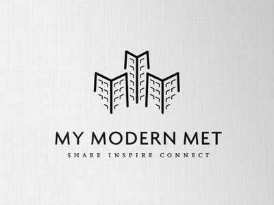
    A revision to the brief means trying to incorporate a little more detail to show towers as buildings. Which is a link to the Met (metropolis) aspect.

    The 3 buildings are formed from the 3 M's as well as conveniently incorporating 3 Y's, focusing on the MY. Realise the 'Y' link is dubious to say the least, but it's there. :)

    The idea was not to make the buildings too realistic, as the main idea was to focus on the M's. The base of the 'buildings' are slightly splayed out to match the font, which is Today SB Medium.

    Can't help but assume this must be like something else out there, but not seen anything yet on my travels. The whole concept of buildings and initials have been done quite a lot, so if anyone has seen anything like this, would appreciate a head's up.

    likes

    almost 2 years ago

  2. Pro Me2011 Kyee

    very nice : )

    almost 2 years ago

  3. Pro Jvl-twitter Jason Vanlue

    Nice job Graham...love the windows.

    almost 2 years ago

  4. Andy Andrew Houle

    Very effective logo, nice work Graham!

    almost 2 years ago

  5. Pro Gedy Gedy Rivera

    Great logo. I love how you used the M's in the buildings and the typography for both the name and tagline are perfect. I'm such a fan of your work.

    almost 2 years ago

  6. Pro Dean-hudson-80px Dean Hudson

    I like it Graham, the three M's are subtle but clever and your type choice is spot-on as usual.

    One thing bothers me though – the splayed out buildings make the perspective feel a bit off? I think I prefer the straighter lines of the previous mark… Also, how does it look without the rounded tips on the strokes?

    almost 2 years ago

  7. Pro Morgan2 Morgan Allan Knutson

    Love this!

    almost 2 years ago

  8. Portrait1 Graham Smith

    Thank you for the comments.

    Jason : Realised that on the inner faces of the outer buildings, am missing one at the bottom, needs to line up with the imaginary line. :)

    Gedy : Thanks a lot, still realing from your icons :)

    Dean : Yup, see what you mean, wanted to try and link them with the typeface, but doesn't quite look right at this angle. May look at that again. :)

    almost 2 years ago

  9. Avatar Andy Birchwood

    +1 Dean's comment, the splaying looks like a mistake. I think it would look just as good if the angle of the verticals was the mirror of the verticals in the type.

    On the windows, could you try having the shadow thrown in a consistent direction?

    The typography is perfect :)

    almost 2 years ago

  10. Portrait1

    Here we go again, further changes and stuff. A few of you mentioned about the windows and also the 'splaying' out of the bottom of the buildings. So have taken that to heart and altered the logo.

    Have kept the walls dead vertical, as well as adjusting the window highlights for left and right on each wall face.

    Also, to define the 3M's, I have thickened up stroke that makes the 'm' part of the buildings, and made the center wall stroke a little thinner.

    Am experimenting with adding some roof detail, as a finishing touch, but not sure yet if this causes too much clutter. Also looking at subtle shading on one side of each building.

    Thanks for previous feedback, the changes do work.

    There are still some tweaks to make, the way which the bottom windows now seem to align oddly on the inside walls, due to flipping the window reflections etc.

    Although the window strokes look a little inconsistent, they are all the same weight, it's just a display thing.

    almost 2 years ago

keyboard shortcuts: previous shot next shot L or F like