RVTA - Brand Concept

When I started this project, it was just a small logo redesign... I had an idea and worked it out (see it here)…
...and then I waited a little bit. I let it marinade in the brain juices. I started to think about other parts of the brand - the signage, the way finding, the app, the social media… - and I started to see a bigger problem past the outdated logo and branding in disarray. So I dove deeper and got inspired and created this branding set.
Now granted, it’s not complete; it is only a concept after all. But the core tenants of a good municipal brand are present. Crisp clear logo that people can easily identify. Good way finding and consistent branding. A modern look and feel that appeals to all ages. A good civic design that could be implemented in a heartbeat.
background
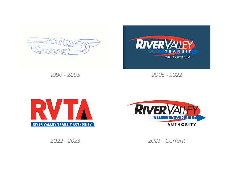
The good ol’ City Bus… or River Vally Transit Authority as it’s called today, has been Williamsport’s metro bus system for over 50 years. It’s had a few different logos over the years. Despite its awesomeness, it is hard to find a good version of the original City Bus logo online (hence the sketch). It was a beautiful logo. In 2005, with the expansion further into the metro area, they rebranded as River Valley Transit with a period appropriate logo. In 2022 they spun off from the local government and rebranded as River Valley Transit Authority adopting a rather clunky, but okay new logo. They would use this logo for not even a year before reverting to something akin to their original branding, swapping the location name for Authority; no doubt a cost saving maneuver since most the branding still reflected the old logo changed a mere 6 months or so prior and at a distant glance would still look the same.
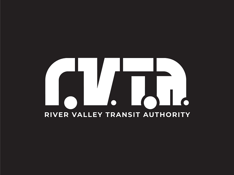
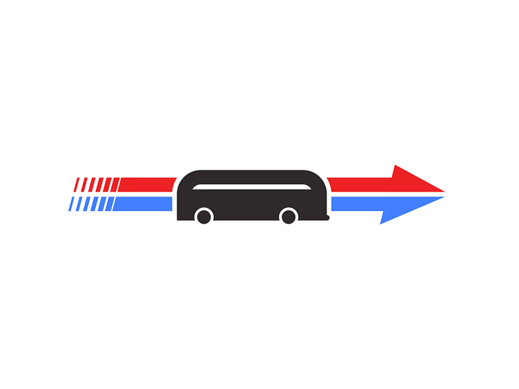
the redesigned logo
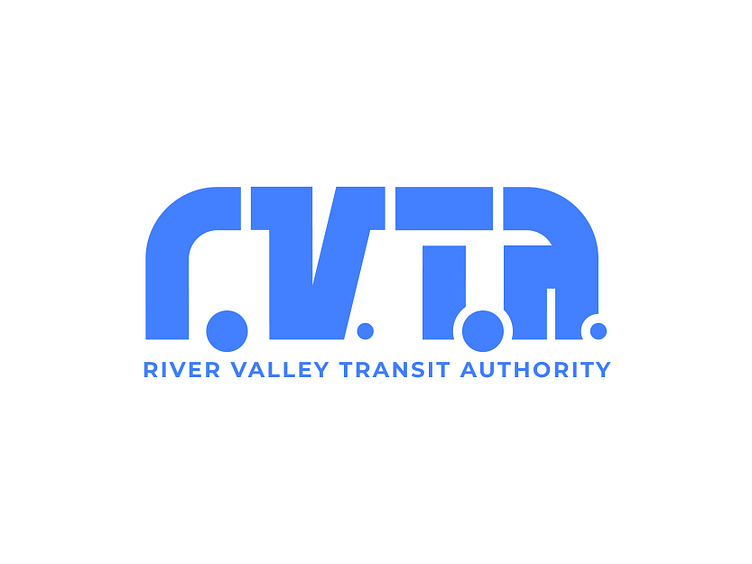
The new logo came to me by accident while trying to concept a logo based off the original swooshes and motion of the City Bus logo. When showing a flowy version of my logo to someone they immediately remarked how similar the shape of the text was to a bus and the concept took off; albeit with less of the nostalgia. The periods that came after each letter immediately helped form the bus further and it all clicked.
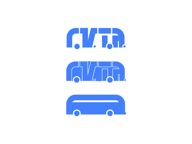
The logo’s evolution into the brand’s bus icon was easy as it happened almost organically from the logo form. The middle logo, a combination of the two, could easily be utilized as a secondary logomark.
tone and voice
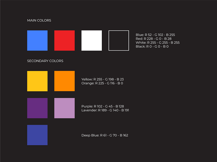
When crafting the color palette I softened the colors a little; opting for a lighter blue over the harsh industrial dark they previously carried. A mix between their primary and their current bus’ almost cyan hue was chosen. The rest of the palette is rounded out by solids that compliment the brand’s red and blue nicely.
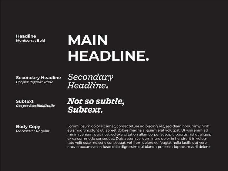
A modern san serif and playful serif combination helps bring the branding set to a crisper, more modern feel.
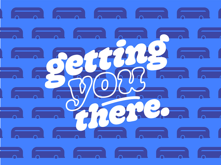
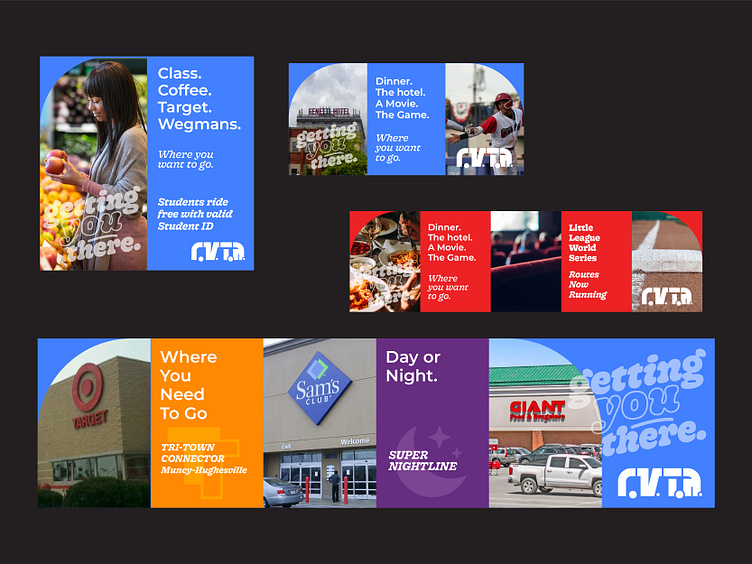
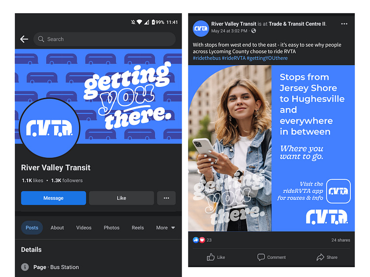
Tone of voice for the brand is focused on the rider. Getting YOU there; where YOU want to go; etc… This will, hopefully, embolden the rider into the choice of the bus over other transportation options. The tagline ‘getting you there’ is kept but an emphasis on YOU is struck.
Due to the design system, billboards and advertisements can become monetized allowing RVTA to swap stock photos for businesses along highlighted routes.
get deeper
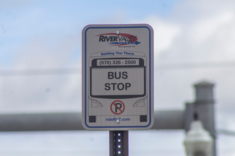
While scouting pictures for the mock-ups for my initial branding, one of the big things I noticed was how outdated the bus stop sign actually is. It’s unique, utilizing a line-art depiction of the bus’ front to help riders distinguish the bus from a distance. However due to the line weight, this would only be clearly visible from a close proximity to the sign. The ‘Bus Stop’ text also is rendered at a small size making hard to easily distinguished from a distance. The URL’s placement and size frequently means that on most signs it is obscured by the sign’s mounting bolt, causing it to get lost or be ignored completely.
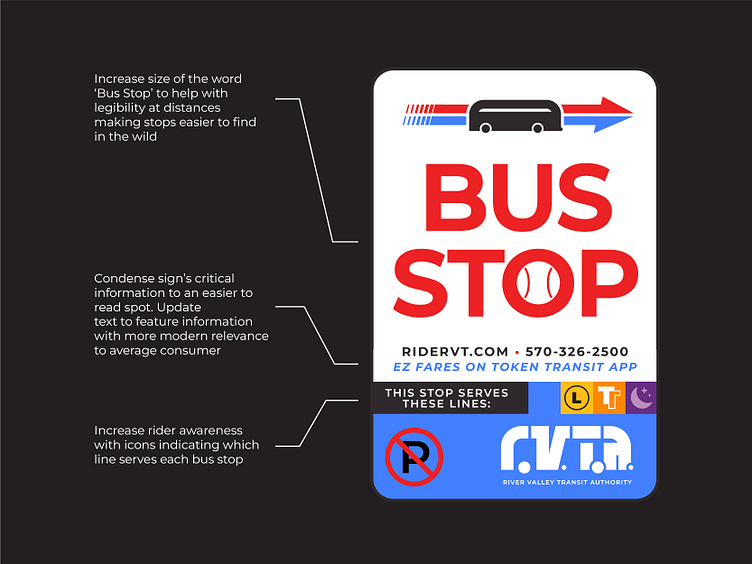
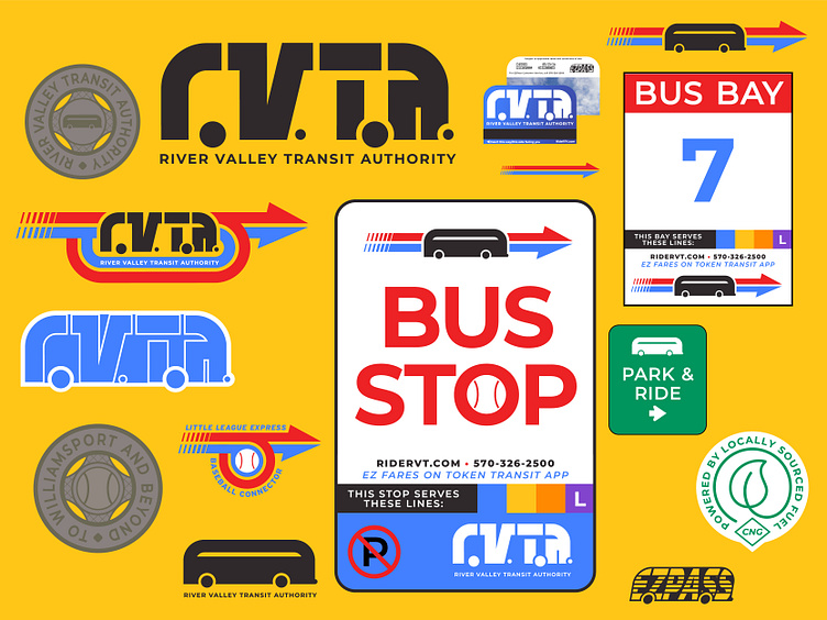
The sign’s modernization relies on a two key concepts: legibility and information provided. The increased legibility on the word bus stop will help riders easily recognize the signs from a distance; especially in areas that have less stops. Modernizing the information to feature the fares app will help encourage riders who may not think they can ride. Over the course of my research into the project, I noticed that some RVTA stops retain line information, but not all; a critical bit of info when the stop is further from the downtown lines. The sign has been modernized to feature a customizable location that changes based on which line services each stop; something a lot of larger cities incorporate into their designs.
One thing I struggled with was which app to include on the sign. As it stands today, they have two apps they use for the service - one for fares and one for ride times, bus tracking, and route information. I chose the one for fares as the other app’s information can easily be found on the website, which is also listed above.
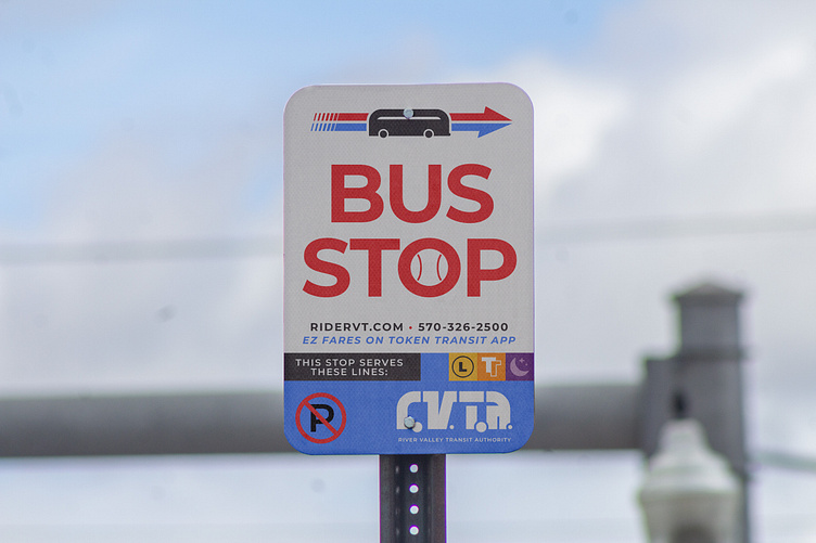
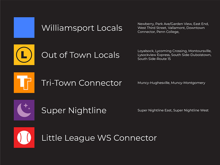
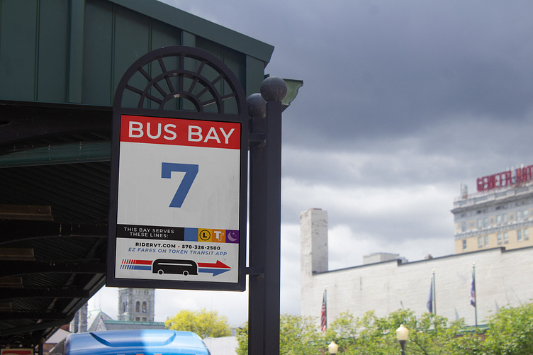
A big thing I noticed during my research was that RVTA has a lot of bus routes; it’s kinda hard to keep track of them all. So the routes get condensed into groupings called Lines. Each line gets a color and icon to better associate the routes. In the city the lines would be basic blue - the brand’s main color. Out of Town Local routes become yellow - with a circled L for the icon. Tri-Town Connector routes become orange - a double T icon. Super Nightline routes become purple - a Moon with stars icon. Given their prominence during the series each year, the Little League World Series routes would get their own designation - red with a baseball.
This concept would carry over to the bus terminal as well.
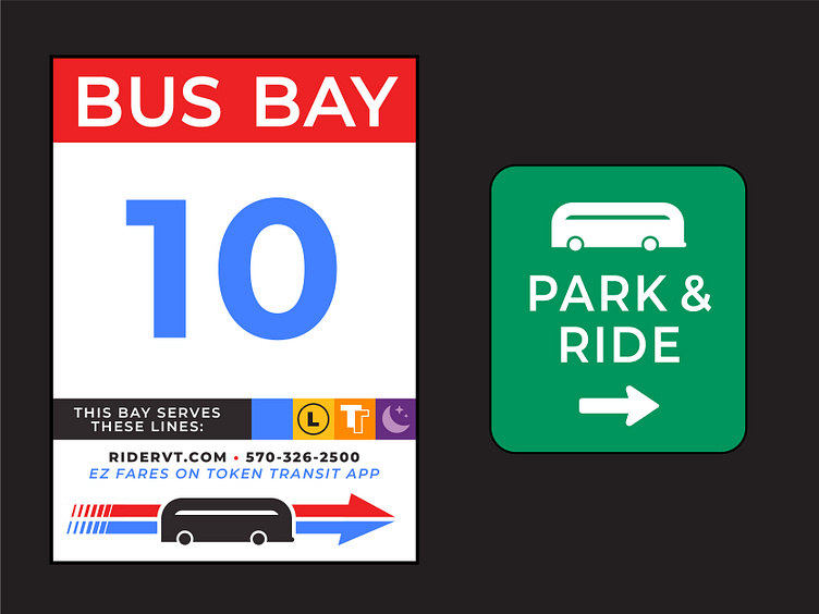
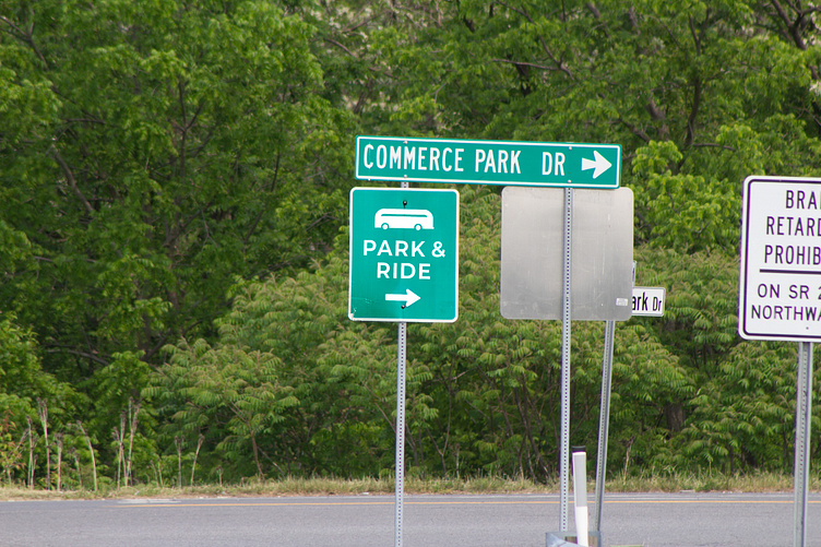
Updating the park & ride sign to feature the RVTA bus would
help with brand recognition.
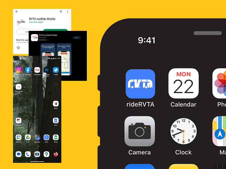
Another big disjointment in the RVTA brand is their app - RVTA myRide Mobile. The app itself is great; could be prettied a bit but that’s not the problem. The problem lies with the app icon/name. While the logo is the icon, the white on black text doesn’t render well at the small size making it mainly just look like the swoop and arrow; which is kinda good for brand recognition if you know those symbols but not super pretty to look at. Also the Android version renders the logo way too small.
In order to bolster the brand, and because it makes sense, the app should be renamed to rideRVTA (The website and social media's should be updated to this as well, but that’s for another day). An updated icon featuring the bold new logo would look well at home next to the other apps and would look a little more appealing than the one they have now.
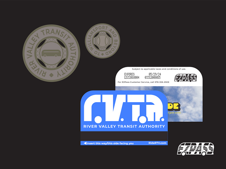
Updated bus tokens that feature the RVTA Bus as well as the brand’s baseball. Updated EZPass cards would feature the brand’s signature round flavor.
so so deep
Social media would get a revamp utilizing the design system and slogan.
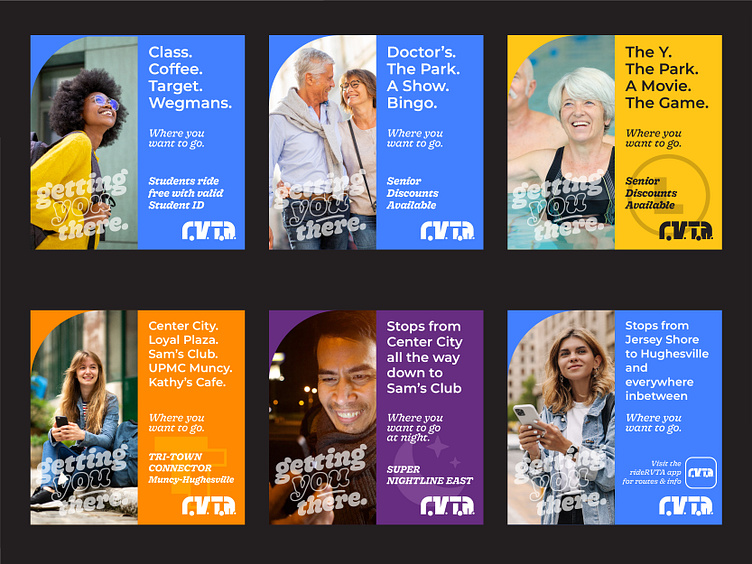
Ad background color changes with the design system's colors and elements to help highlight different lines.
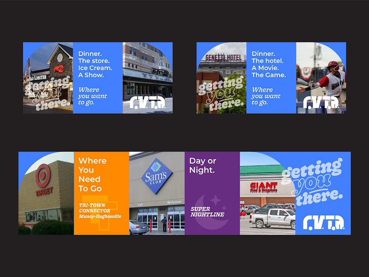
Due to the design system, billboards and advertisements can become monetiezed allowing RVTA to swap stock photos for businesses along highlighted routes.
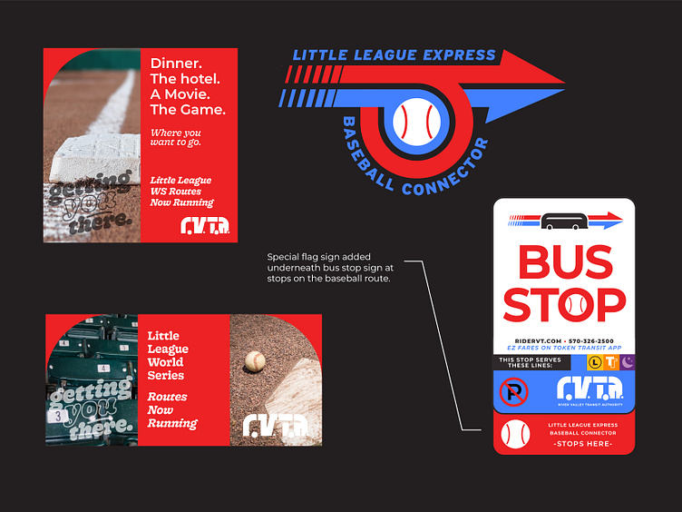
Little League World Series centric branding advertising
the bus routes that run during the series
last but not least
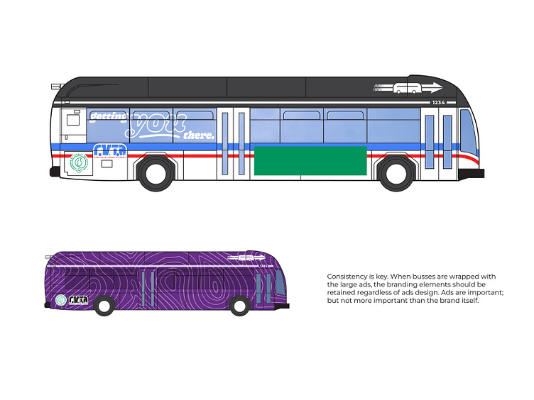
Last but not least, the bus design… I was really bummed with this one because I couldn’t find a great quality blank to re-skin, so I only have line-art… but this one harkens back to the City Bus days. Black top with blue and red striping on the side. I kinda left the bus design go until the end. I know it’s the most critical part but I found the other problems and was too keen on that.
- End -
So yeah… if you want my advice. This is what I’d do to better the RVTA brand.
I’ll admit it; this one kinda got away from me. A lot of ideas and whatnot. But I enjoy branding. I enjoy getting deep and figuring out all the little problems… hope you enjoyed. Give it a like, if you’d be so kind.
Liked what you saw and want to work together? Email me at nrundio@gmail.com


