bus concept (work in progress)

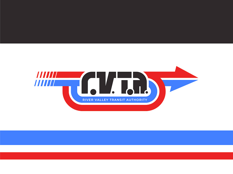
I've had this idea bumbling around in my noggin for a few weeks now... our local regional transit authority has had an identity crisis the past year or so as it has swapped between two different logos. While okay design-wise, I'm not particularly fond of either. So I developed this.
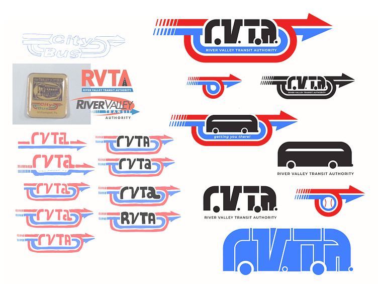
The arrows harken back to the old City Bus logo, one of my all-time favorites, that was used before they rebranded in 2005 to River Valley Transit and, more recently, River Valley Transit Authority... Very much a work in progress. I'm still trying to figure out how to integrate the slogan into it.
I think works well and is recognizable even at a small size. While not my original intent, I showed it to someone and it was immediately recognized as a bus shape, so I went with it... I'm still trying to figure out how the bits and pieces would tie into the overall branding (bus stop signs, banners, marketing, etc...). I always like to see the bigger picture with the logos I create...
Be sure to check back later for my rebound as I finalize the branding set with the rest of the mock-ups.


