Find designers
Designer search
Quickly find your next designer
Post a job
The #1 job board for design talent
Inspiration
Courses
UX Diploma
Learn UX design from scratch in 6 months
UI Certificate
12-week UI skill building for designers
Live interactive workshops
with design professionals
Jobs
Go Pro
Log in
Dribbble: the community for graphic design
Log in
Sign up
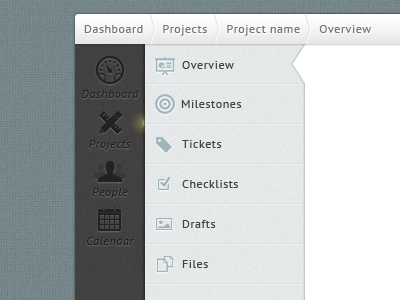
Navigation for project management app 2
Milos Milikic
Follow
Following
Like
#DFDFDF
#AFAEAE
#5D5750
#9D6646
#B38A68
#D1AFD1
#957C99
Download color palette
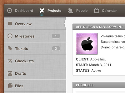
...decided to apply some changes. What do you think?
Rebound of
Navigation for project management app
By
Milos Milikic
admin
admin panel
app
dashboard
interface
management
menu
nav
navigation
panel
project
sidebar
ui
user
user interface
View all tags
Posted on Jul 11, 2011
22,752
103
393
19
View feedback
Milos Milikic
More by Milos Milikic
View profile
Previous
Next
Loading…