Find designers
Designer search
Quickly find your next designer
Post a job
The #1 job board for design talent
Inspiration
Courses
UX Diploma
Learn UX design from scratch in 6 months
UI Certificate
12-week UI skill building for designers
Live interactive workshops
with design professionals
Jobs
Go Pro
Log in
Dribbble: the community for graphic design
Log in
Sign up
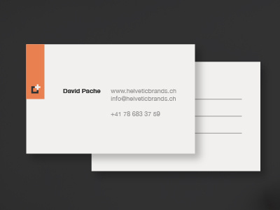
New business card
Helvetic Brands®
Available for work
Follow
Following
Like
Get in touch
#303030
#EFEEEC
#C8BFB9
#E98051
#BD8870
#E07B4F
Download color palette
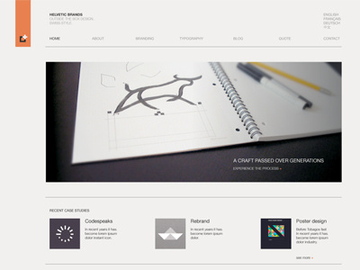
Rebound of
Portfolio redesign
By
Helvetic Brands®
branding
business card
collateral
logo
print
stationery
View all tags
Posted on Feb 19, 2011
15,946
26
182
16
View feedback
Helvetic Brands®
Outside the box design, Swiss style
Get in touch
More by Helvetic Brands®
View profile
Previous
Next
Loading…
Loading…
Loading…