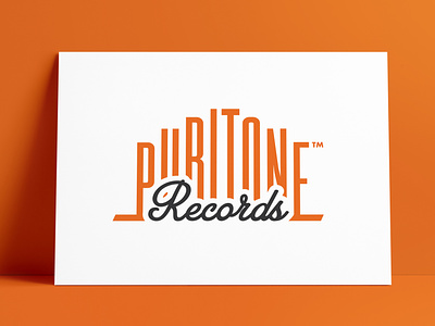
Puritone Records Logo & Record Label Designed by The Logo Smith

Presenting from the @thelogosmith aka Smith.™ Logo Design Portfolio Archive.
A Dribbble Portfolio of #LogoDesigns #LogoMarks #BrandMarks #TypeMarks #WordMarks #Emblems #Symbols #Icons #BrandIdentities
———————————
→ Client: Pure Storage / Puritone Records
A previous large client of mine, Pure Storage (I designed the Pure Storage brand logo design), approached me to design a retro-cool logo that would be used to brand a fun side-project of theirs, called: Puritone Records.
This was one of the quickest turnaround logo design I have done, and especially one for such an important client as Pure Storage.
Puritone Records Logo in 5 Days!
I had just 5 days to come up with an idea, and have the files ready to give them for April 1st.
In fact, I started on Tuesday and had the main idea ready to present on Friday. The client’s response to the 1st and only idea? “Holy s**t this is awesome!!! Really, really like the idea!”
Then I had from Friday, and the weekend, to perfect and polish this idea to final files for Monday. Easy…
The Puritone Records Logo Process
I started with the Puritone Records logo type, this would be just the wording, and once I had this general idea mocked-up, it was then a case of then designing a faux record label version.
A few major requests from Pure Storage: that the overall container of the logo be of a similar shape to the Pure Storage logomark (that I had also previously designed for them), a clearer visual example of their logomark within the finished piece, a sense of anti-harddisk sentiment, and an overall design style of reto-cool.
It was somewhat fortunate that when looking at where the Puritone wording would sit, within a rotated version of the Pure Storage logomark, that I immediately saw at least one way to utilise this narrowing space towards the top: which was to progressively heighten each letter of Puritone, which created a pretty funky, and distinctive, typographic style.
The retro style, and efficient use of this narrowing space, was further enhanced by the use of a heavily condensed font.
→ Project Page: Case Study: Puritone Records
———————————
The Logo Smith aka smith.™
→ smith.gl/portfolio
→ smith.gl/hire-smith
The Logo Smith aka smith.™ – a British freelance logo designer extraordinaire – has over 28 Years Commercial Experience, in: Logo & Brand Identity Design; Logo & Brand Redesigns & Updates; Icon Design; Label & Packaging Design; Social Media Branding; WordPress Development (SEO, Security & Performance); Lithographic & Digital Printing; Reprographics; Advertising & Marketing.