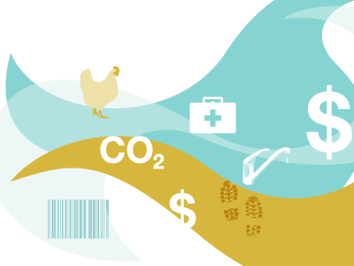
Working on the other pages of this blog. This is when the button "Recent articles" is clicked at the bottom of an article page. Not visible in this screenshot, but I've also foreseen a tooltip when hovering these icon buttons.
After getting feedback from the client that he didn't like the blue I had to rethink my color palette. Now I'm working with a color palette that I wouldn't normally pick as first option but they came out quite nice I think.
First design proposal for a blog design. Light and minimal was the direction I had to think here, even in terms of color usage. At least that was my thinking. But even when I try this, I always get the feedback I need to add more color :...