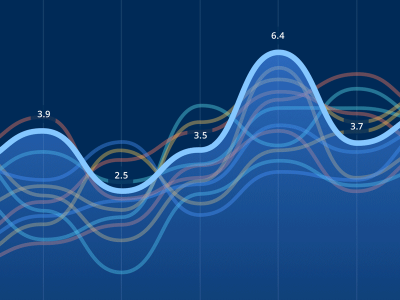
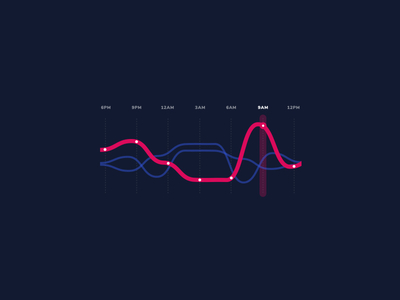
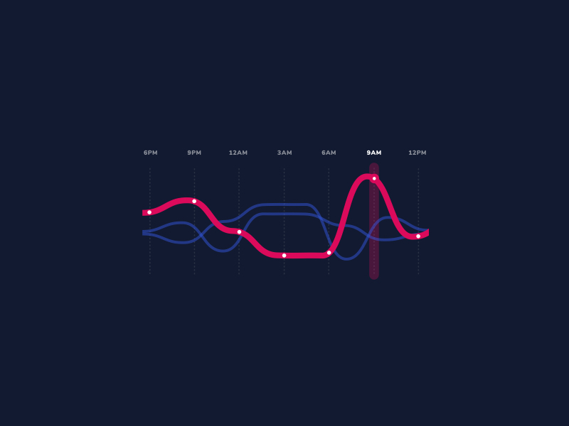
As part of our accessible dashboard interface, we created data visualizations that could be completely customized to summarize the information that was most important to each user. Here's a closer look at an animated line chart module.
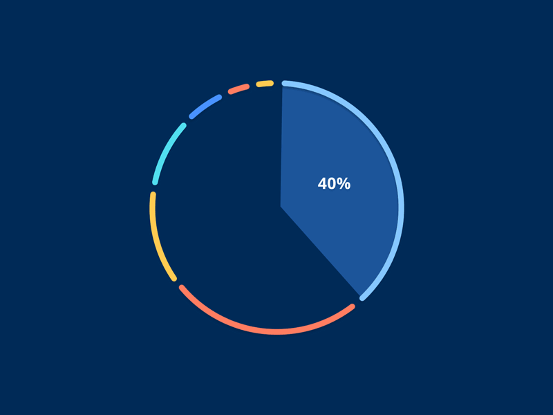
As part of our accessible dashboard interface, we created data visualizations that could be completely customized to summarize the information that was most important to each user. Here's a closer look at an animated pie chart module.
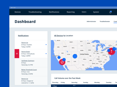
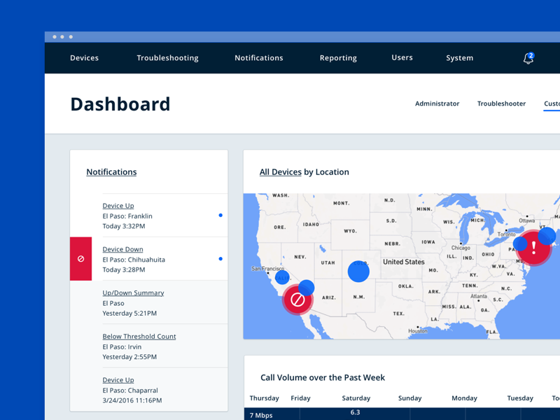
Here's another shot of our Network Visualization Dashboard. We focused on creating a design language that's bold, clean, and doesn't overwhelm users who work in the software every day.
For this project, our design decisions had to compl...
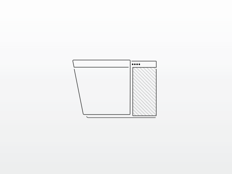
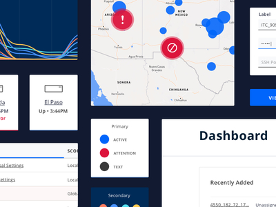
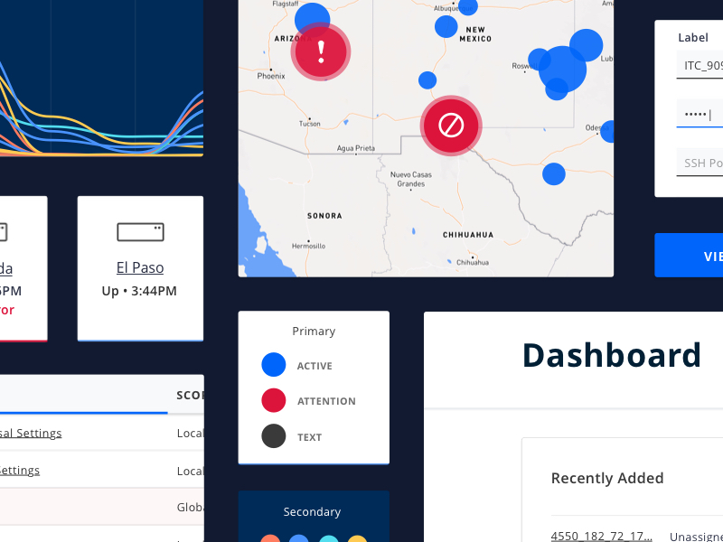
Here’s a look at a style tile we did for an accessible dashboard interface focused on reporting and visualizing network data.
Designers:
@Nikki Clark
@Sarah Johnson
@Morgan Wheaton
@Morgan Gerber