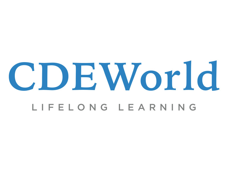
In my continual development of an updated logo. I did away with the icon, I felt it wasn't adding anything to the design as a whole. Concentrated on creating a professional look and feel with the blue and gray. Not original I know but fo...
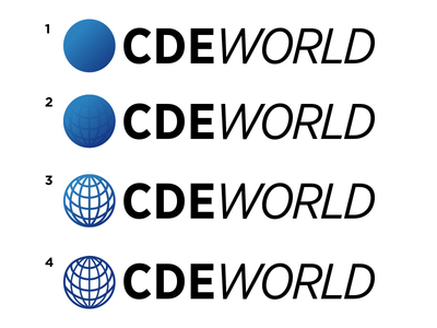
I'm working on updating this company logo. Trying to make it it easier to use on the web, but similar enough to the old logo as to not confuse anyone. Since it's in the medical field, I wanted to keep the design very clean.
I'm leaning t...