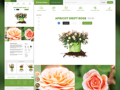
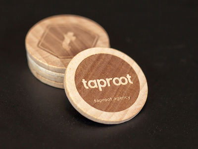
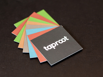
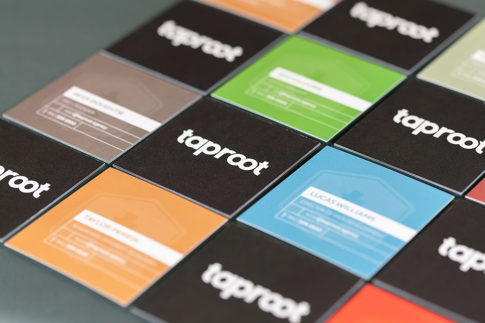
Here is part of the icon set used on our new website. Because a lot of the concepts that they represent aren't exactly easy to show visually, we went with a more abstract approach.
See them in action: https://taproot.agency
It's been a long time coming, but with the rollout of our new agency brand, we finally have a new website.
View full pixels here
And then check it out in the wild and let us know what you think.
View site
Taproot has an updated brand book to go along with our new logo and website. We're keeping it flexible so it can evolve along with us, but it's always good to have a baseline to start.
Our new agency logo family includes a type-based word mark and a secondary symbol. The goal of the redesign was to create a clean, timeless identity family that “gets out of the way” and allows us to focus on what we do for our clients, ...