close

Get inspired: Muted color palettes that speak volumes

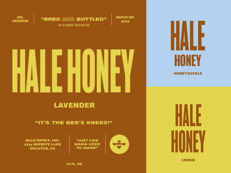
Muted colors in design can help your audiences enjoy a new peace of mind that emanates from low saturation or chroma — just like the color palettes in this collection.

Quite literally the “opposite of saturated” these designs are subtly elegant. As vivid colors of our past are slowly replaced with harmonious combinations of green, orange, beige, and other shades of “calm” we can enjoy feelings of safety, familiarity, and nurture.

Muted color palettes bring a modern and genuine look and feel to any design project. Perfect for a conscious product or brand, muted colors can be added to anything from packaging to illustrations, to logo color schemes.

📌 Pro tip: Experimenting with a muted palette? Try using a small amount of vivid color in your designs as a contrast and for an extra pop of color!

Muted color palette inspiration

Get inspired by a lively collection of muted color palettes in design. See something you like? Like, follow, and share these creative designs!

Casa Pueblo Palette branding color palette colors colors palette colour neutral tones

Casa Pueblo Palette

by Aitana Barredo

A rather neutral color palette inspired by native flora and the clean and bright plastered walls of Casa Pueblo, combined with an elegant and stylish font combination give the design its neat and minimalistic feel. 

View on Dribbble

Sum Bar coasters branding chinese coaster dim sum identity layout logo modern restaurant typography wordmark

Sum Bar coasters

by Rebekah Rhoden

Front/back coaster designs

View on Dribbble

Hale Honey 60s bee branding color honey honeybee icon illustration lettering logo mcm midcentury packaging propoganda retro type typography vintage

Hale Honey

by Emma Harris

A fun, modern honey branding design. Wanted to play with a pattern and style that wasn't often seen in a homegrown, local product design.

View on Dribbble

Stratified branding color palette colors

Stratified

by Focus Lab for Focus Lab

The Thrive color palette is inspired by layers of strata, each representing a foundational aspect of their company’s history, diversity, adaptability, and impact. --- Looking for a brand agency? We would love to hear from you. Email us: hello@focuslab...

View on Dribbble

Jam of The Week | 135 album art branding cover art design graphic design illustration indie logo music music art passion project psych rock pysch rock typography ux
Shot Link

Jam of The Week | 135

by Britton Stipetic for Rogue Studio

The jam of the week is "Border On Border" by Nights Moves | Listen Here Want more? Rogue Site / Our Store / Instagram / Twitter

View on Dribbble

Favourite patterns 🌈 brand branding color color palette color scheme colors combination design exploration exploration visual brand instagram instagram post pattern patterns
Shot Link

Favourite patterns 🌈

by Lucie Bajgart

My favourite pieces in the last month or two. ✨https://www.instagram.com/khromacolors/ Have a lovely day, Lucie Instagram Twitter Behance

View on Dribbble

Kilimanjaro Sans - Use case example 70s 80s 90s bold brand california eighties font logo matchbook matches nineties old retro sans seventies summer type typeface vintage

Kilimanjaro Sans - Use case example

by Nicky Laatz

Had to add a matchbook to the list!https://creativemarket.com/Nickylaatz/6995676-Kilimanjaro-Sans-Font

View on Dribbble

0013 60s 70s 80s abstract artwork background colors free freebie future geometric modern modernism mural pattern poster retro scifi shape vector

0013

by Normform

Retro-looking abstract geometric pattern artwork, made with vector graphics elements and various geometrical shapes. Horizontal composition. The artwork image is available for free for personal and commercial use on our website: https://normform.art/0013

View on Dribbble


Find more Inspiration stories on our blog Courtside. Have a suggestion? Contact stories@dribbble.com.


Previous
Next