


This article was written by Michael Li—a data scientist and entrepreneur with a love for design. Previously at Foursquare, Google, J.P. Morgan, D.E. Shaw, and NASA.
I have a confession to make. I’m not a designer, just a design-curious data scientist. So when I sold my data-science startup and started playing with web design, I searched for data to help guide my design decisions.
Design is a high-dimensional problem: there are hundreds of CSS variables we could set for just a single tag. It’s hard to know where to start. The whole process can begin to feel like a bewildering random walk through a mesmerizing but ultimately foreign landscape. And most designers seem to rely on gut feel and years of hard-won experience to make their design judgments, which doesn’t help the intuitionally challenged neophyte. So I took a page from the data scientist’s handbook and began gathering data for a project I’m calling Design Data (@DesignDataBlog).
I crawled over a million homepages and saved their HTML and CSS files to analyze every aspect of a website, from images and layout to font and color. For this article, we are looking at the top thousand websites when viewed as desktops (see the Details and Caveats section for more about the specifics). I used puppeteer to parse even javascript-rendered website.The goal was to provide some numerical insight and benchmarks to better quantitatively understand the world of web design.
Note — These findings aren’t intended to be a rigid style guide: design is a rich and human-centered discipline, after all. We should never forget that. Just because 85% of fonts online are sans-serif (see below) doesn’t mean you need to only use a sans-serif font. But if you do choose to go against the grain and adopt a serif typeface, how much are you really standing out? And when is it more common to use a serif font?
So without further ado, let’s dive into our first blog post, which is all about fonts:
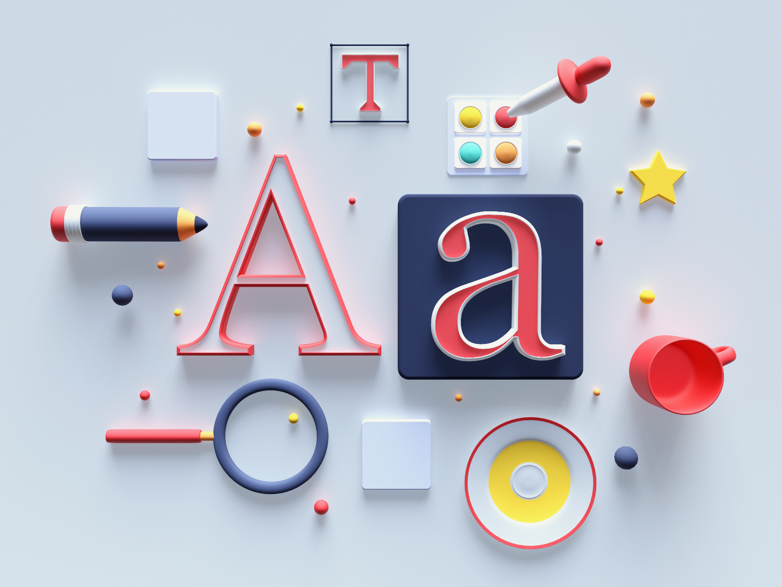
Font-family
Typeface choice is an emotional topic: just look at the hundreds of reactions and dozens of comments for this proposal to change the default font family in normalize.css . Within fonts, perhaps the most prominent civil war is between serif and sans-serif. And who’s winning this battle on the web? You may not be surprised to learn that it’s sans-serif. On average, we estimate 85% of fonts are sans-serif, with the remainder left for serif, monospaced, and everything else. How did we deduce this? Read on for more!
First, a basic reminder about how font-family works: remember that the font-family CSS property is not just a single value but a prioritized list of fonts. The browser tries the first font and if not available, it processes subsequent fonts in the font-family stack until it finds one the system supports. It’s best practice for a designer to list their intended font first with a list of subsequent backup fonts that attempt to preserve that intent with decreasing fidelity but increasing popularity. So how many backup fonts are sufficient?
The median depth of the font-family stack is 4: one primary font and three backup fonts. But it’s not uncommon for us to see stacks of depth 6 (the 75th percentile) or even 12 (the 99th percentile). One website even had a font-stack depth of 21! Below is a graph of the distribution of depths:

So what fonts are used? Below is the list of the top 10 fonts used throughout the stack. Note that these are not necessarily the displayed typeface—those tend to be website specific. Instead, we see the most common backup fonts:
 </a>
</a>
Of the top 10 fonts, the top nine are all sans-serif. By classifying these most common “catch-all” fonts, we can automatically deduce the first font’s broad properties in the stack, even though they tend to be highly idiosyncratic. Hence, the statistic above on the prevalence of sans-serif fonts.
But we can go further! The above statistic was overall paragraph (P) and header (H1, H2, etc.…) tags. If we look at the fraction of fonts that are sans-serif by tag type, you’ll see a much different story. It turns out that headers are much less likely to be sans-serif, but this probability decreases the more subordinated the header.
So the probability of being sans-serif ranges from 58% for H1 to 70% for H2 to 89% for H5 and 93% for P. If you feel like using serif you’ll be in better company applying it to headers rather than paragraph tags! (It’s interesting to note that this seems to match conventional design wisdom that larger fonts are better suited for serif than smaller fonts. )

But the picture gets even more complex if we think about font pairings. Below, we have broken up the probabilities in each of the 2X2 of serif/sans-serif versus P/H1 tags. We can see those serif headers with sans-serif paragraphs are over twice as common as the reverse. Put another way, the average serif paragraph is paired with a serif header about 51% of the time, but the average serif header is only paired with a serif paragraph 36% of the time. Finally, that most fonts are sans-serif seems to accord with the conventional wisdom that sans-serif fonts are the basis of web design .

One of the most fundamental questions is what size should my font be? Larger fonts are easier to read and more accessible. But smaller fonts have greater information density. How do we balance these competing factors? We crunched the numbers, and it turns out the median font size is 14px. However, you’re just as likely to see fonts that are 16px; 12px and even 18px are not unheard of. That said, it is rare to go below 10px or above 24px.

The picture is a little different when we break things down between serif and sans-serif. It turns out that sans-serif fonts tend to be a little larger. While the median size of a sans-serif font is still 14px, a serif font’s median size is 16px. You can see this larger size in the distribution of their sizes:

Headers
Headers are essential elements that help organize text by facilitating the scanning of a page. Therefore, they are typically in larger font-size and heavier font-weight. But which one do designers choose? Looking at the data, we compare the header tag with the largest text. We find that designers choose to use a larger size more often than a heavier weight (94% vs. 82%), but they often use both (76%). (And in case you’re wondering, we’re using the largest header tag because some websites do not use H1 but opt to make H2 or another header their largest header instead.)

Let’s zoom in on font-weight. It’s not surprising to see that most paragraph tags are normal (400 font-weight) while the plurality of header weights are bold (700). Note that it is also not uncommon to see medium (500) and semi-bold (600) font weights for header tags or light (300) for paragraph tags.

Now let’s look at header font-size. Since the baseline paragraph font size varies by page, the right metric to investigate is the ratio of header font-size to paragraph font-size. Below is the median ratio of font-sizes between the different header and paragraph tags across pages in our dataset. We can see that on the median page, H1 is roughly 1.9 times the size of P: so if P were 16px, H1 would be about 30px (16 x 1.9). The ratio decreases for the subheaders until we get to H5, whose median size is the same as P (and presumably uses a different or heavier font to distinguish H5 from P).

Details & Caveats
Firstly, some credits: a huge thank you to Louis Reid and Kai Lukoff !
Now for the caveats: we used the majestic million for a list of websites but not every webpage is amenable to programmatic crawling so the results are not perfectly representative. The analysis only emulated a desktop browser: in the future, we will consider mobile and tablet browsers, which should yield very different answers on responsive pages. For this blog post, we only analyzed the approximately top 1000 websites to save time. We don’t distinguish between foreign-language and English-language websites, nor do we distinguish between different types of websites. Obviously, if you’re designing for The Daily Mail, you have a very different look than a Medium blog.

We could do all this and so more but …
Over to you: What else would you like to learn?
Design Data is a dialog! I’m interested in what designers, data scientists, and the broader community think about design and what quantitative insights people want to learn. I want to analyze and write about what you find interesting. What would be helpful for you to know? What are the burning questions you’ve always had about design? What would you want to read about? Sign up on our substack or follow us on @DesignDataBlog to get the latest and tweet or write out! ■
About the author: Michael Li is a design-curious data scientist. He is the founder and president of The Data Incubator, which he sold to the Pragmatic Institute. Previously, he worked at Foursquare, Google, Andreessen Horowitz, J.P. Morgan, D.E. Shaw, and NASA. He writes for the Wall Street Journal, Harvard Business Review, Tech Crunch, Wired, and Fast Company. Michael was a postdoc at Cornell Tech, a Ph.D. at Princeton, and a Marshall Scholar in Cambridge.
Find more Community stories on our blog Courtside. Have a suggestion? Contact stories@dribbble.com.


