


Color has one of the most significant impacts on the emotional and behavioral actions of users of a design. The right colors can evoke particular emotions when a visitor comes to a website, such as trust, enthusiasm, or refinement. But beyond that, color can directly impact the behavior of visitors.
The right color can increase conversion rates, while the wrong one can drive users away. And while established color meanings and other aspects of color theory might dictate that certain colors will always outperform others, in the real world those norms often go right out the window.
Understand Color Theory First
Before you can break a rule, you need to not just understand it, but also master it. Mastering at least the basics of color theory gives you a solid understanding of where the rules can best be broken, and where to simply bend them.
There are two main concepts in basic color theory that you should understand: the generally accepted meanings of colors (which plays heavily into the psychology of color) and the schemes used for combining colors (which influences the psychological impact they have). Here’s a quick rundown of both to get you started:
Color meanings:
These are the generally-accepted meanings in most of the Western world for the most common colors (or hues). Be aware that different cultures interpret color meanings differently, so you’ll want to research color meanings applicable to your region.
- Red: passion, love, danger, anger
- Orange: joy, energy, warning
- Yellow: happiness, optimism, creativity
- Green: nature, fresh, growth, money
- Blue: loyalty, calm, honesty
- Purple: mystery, royalty, luxury
- Black: mystery, darkness, power, strength
- White: safe, clean, innocent
- Gray: sophistication, elegance, formal, emotionless
- Brown: nature, solid, grounding
Color meanings can shift based on the exact color used and the surrounding colors.

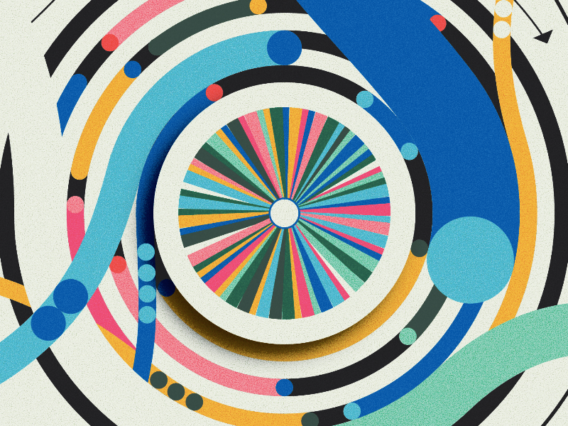
Traditional Color Schemes
There are several traditional color schemes built off the structure of the color wheel. These traditional schemes are used with varying shades (when black is added to darken the hue), tones (when gray is added to mute the hue), and tints (when white is added to lighten the hue) of each color. They are:
- Monochromatic: Different shades, tones, and tints of a single color (or hue).
- Analogous: Three colors that are next to each other on the color wheel (with the main color being in the middle).
- Complementary: Two colors that are opposite each other on the color wheel.
- Split complementary: A main color paired with the colors analogous to its complementary color.
- Triadic: Three colors spaced evenly around the color wheel.
- Tetradic: Two colors next to each other on the color wheel paired with their complementary colors.
- Square: Four colors spaced evenly around the color wheel.

Why Do You Want to Break the Rules?
The first thing to consider when looking at breaking the established “rules” of color theory is why? Is it because every brand in your industry is using a variation of the same color palette and you want to try something different? Is it an experiment just because? Is the company you’re designing for on the cutting edge of their industry and you want to make sure their branding reflects that? Do you have a solid reason?
Breaking the rules simply to break the rules is rarely a recipe for success. If you can nail down your why then you’ll have some direction for how to effectively break the rules.

Use Unexpected Colors
One of my favorite examples of how to effectively break the established norms of color psychology is in the conversion rates of CTA buttons. Established color meanings would dictate that a green button would outperform a red one since green is strongly associated with “go” and red is strongly associated with “stop” or “danger.”
In a test conducted by Hubspot on a client website, however, they found that a red CTA button outperformed a green version by 21%. Part of this might be explained by the fact that green was heavily used in the overall color palette, making the red button stand out more. But it still goes against the established wisdom of color psychology. The takeaway is that using unexpected colors can draw attention to specific elements, increasing user engagement.
Using unexpected color palettes for a design can also draw attention and become memorable, which is a key goal of color psychology beyond influencing a user’s emotions and behavior. If you look at sites for financial institutions, you’ll find that the vast majority of them use jewel tones, specifically dark green and navy blue (with a few daring outliers using maroon or dark purple, both still very traditional colors). Green and blue are associated with money and honesty, respectively, so their use makes sense in that industry.
But that doesn’t mean you have to stick to those palettes. Payment processor Stripe uses a multicolored header that doesn’t resemble anything else in the finance world. Sure, there’s some dark blue within their UI, but much of the content is set apart in either lighter blues or shades of purple. It’s unexpected and because of that, they stand out.

Use Color in Unexpected Ways
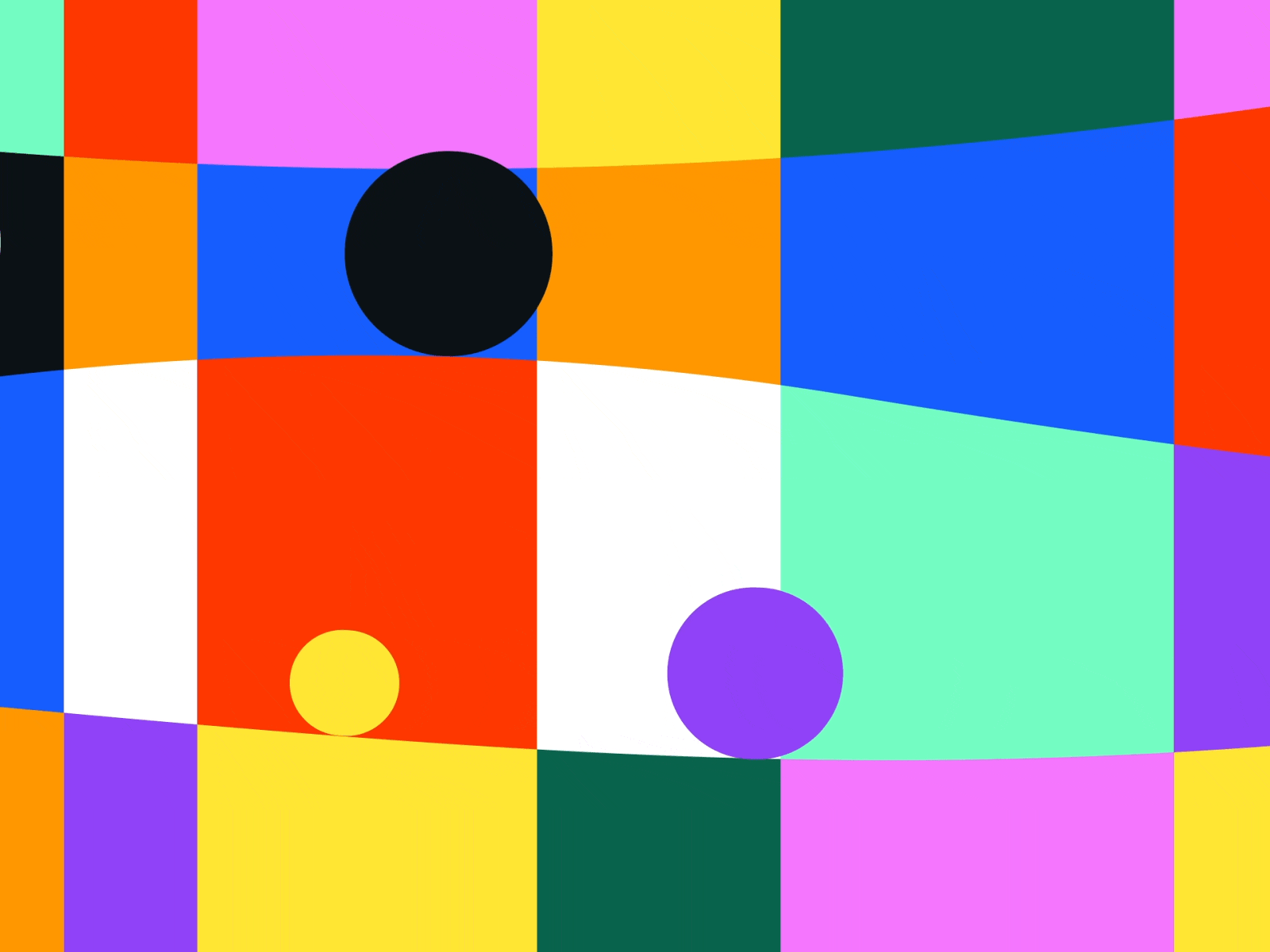
There are some established guidelines about how many colors you should use in a particular design, namely that you should use no more than three colors (a main color, a secondary color, and an accent color), not including black, white, or gray. But that rule gets broken all the time and to great effect.
The Altrüus website is one example of using more than three colors. It combines dark bluish-purple, light blue, yellow, hot pink, and mint green (along with black and white). It makes the design appear lively and fun, which fits perfectly with their social gifting business model.
Logo design tends to be even more strict that UI design when it comes to how many colors to include, with established “rules” limiting it to just two colors (again, not including black or white). But then companies like Google, NBC, and even the Olympics use multi-colored logos effectively.
The main thing to keep in mind when using color unexpectedly and breaking the rules of color psychology is how it impacts a user’s perception of and interaction with your design. The key to color usage is that if it works, it’s correct, even if it breaks every color theory rule you’ve ever learned ■
 About the Author — Cameron Chapman: Editor. Blogger. Author. Designer. Copywriter. Marketer. Entrepreneur. Speaker. Consultant. Coach. I wear a lot of hats. What most of them have in common, though, is storytelling.
RELATED READING:
- Color stuck? Try the color palette finding technique graphic designers love
- 6 handy color palette generators for graphic designers
- 7 UI tools for creating better digital color palettes
- How to create dreamy color blurs in Adobe Illustrator
- A practical guide to working with color in digital illustration
Find more Inspiration stories on our blog Courtside. Have a suggestion? Contact stories@dribbble.com.


