


Ever wonder how designers create those blurred grainy gradient-like effects in Adobe Illustrator? Today, we’re sharing a quick and easy Adobe Illustrator tutorial to help you achieve the same look and feel. These dreamy color transitions and gradients have become quite the trend this year in graphic and web design, and it’s easy to see why.
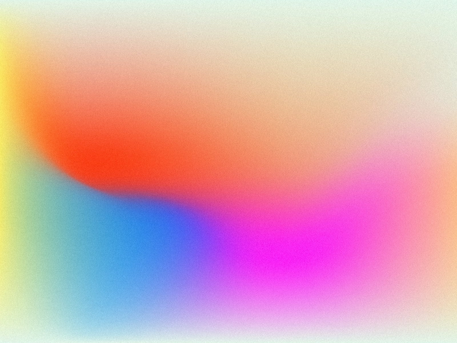
Unlike traditional gradients that we are accustomed to creating using the Gradient Tool, this new technique makes use of Adobe Illustrator’s Mesh Tool—allowing for way more control and an infinite amount of unique color possibilities. Take a look at some examples:


Row 1: Ryan Hammond, Script & Seal, Ryan Hammond for Herefor Studio.
How it’s done
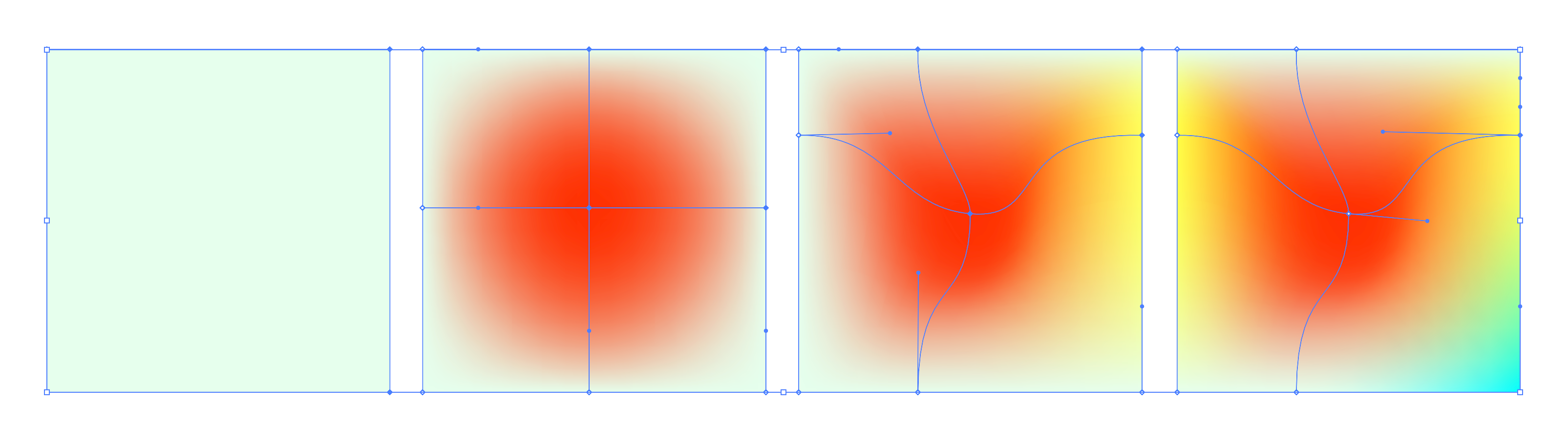
We asked designer and partner at Herefor, Ryan Hammond, to break down his process for creating these blurry looking gradients. Ryan was kind enough to share his technique as well as a step-by-step visual of the process. Let’s take a closer look:
1. Start with a base color applied to a shape, then using the Mesh Tool in Adobe Illustrator, begin adding color. A color can be applied to any anchor point once you initiate the Mesh Tool within that shape (the hot-key for the Mesh Tool is ‘U’). You can create a more complex gradient by adding anchor points.
2. The process beyond that is a bit of a hybrid between finger-painting and watercolor. You can push and pull color through the shape, but overworking or using certain colors can turn it into mud. You can always delete anchor points within the shape if it gets out of control.
3. That’s it! I sometimes apply a little texture to it in Photoshop afterward.
Examples to inspire your designs
Now that you know how to start creating dreamy color blurs in Adobe Illustrator, here’s a curated collection of examples to inspire your next design. The color blur effect looks wonderful in many different applications from graphic design to branding, UI design, and more. We encourage you to keep experimenting with all of the endless possibilities!


Row 1: Kyle McDowell 🤘🏼, Valery Cheplygin, Giga Tamarashvili for Bold Monkey. Row 2: Ryan Hammond for Herefor Studio, Aleisha Samek, John Oates for Focus Lab. Row 3: Jacob Etter, Omnium, Vladimir Gruev for ooze.
MORE GRADIENT RESOURCES
- 5 ways to get creative using gradients in graphic design
- Gorgeous Gradients: A curated collection of dreamy color transitions
- 5 excellent online gradient picking tools for designers
Find more Process stories on our blog Courtside. Have a suggestion? Contact stories@dribbble.com.


