


Landing pages can be one of the most important parts of a website. While a homepage needs to be all things to all visitors, landing pages have very specific functions and requirements. Mastering landing page design—creating landing pages that convert—can set a designer apart from their competition.
Here are eight basic things to keep in mind when designing a landing page


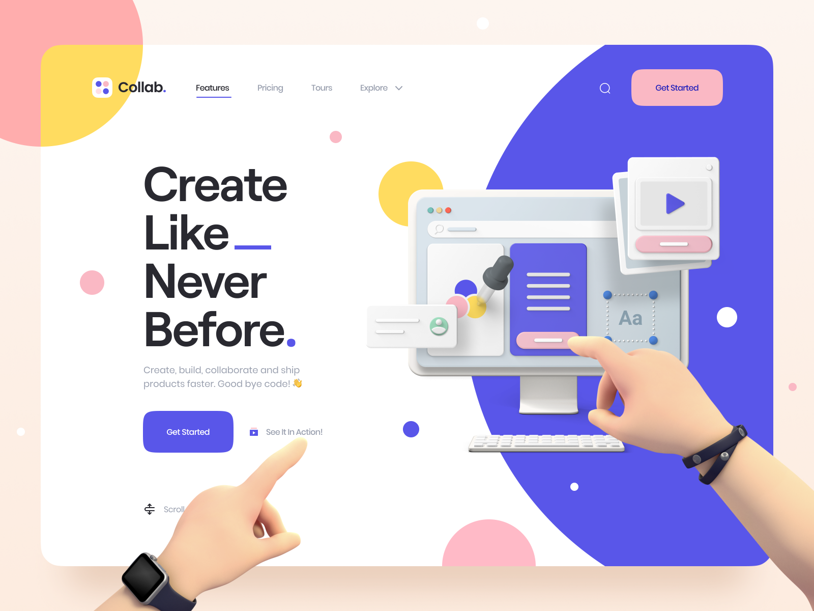
Row 1: Jesper Dahlqvist, Vladimir Gruev for ooze, Outcrowd .
1. Use Established Patterns
There’s a reason that most landing pages look alike. Years of testing different patterns for creating landing pages that convert have resulted in a few distinct variations. While it’s fine to experiment with other patterns, know that those other patterns have likely been tried and discarded by others in favor of layouts that converted better.
One of the most common landing page patterns is the “long sales letter” style. These landing pages have been shown to sometimes convert at much higher rates (as high as 662% more compared to control pages) than shorter pages, especially when calls to action are sprinkled throughout the page. But, sometimes shorter pages do convert better. It’s worth trying both.
2. A/B Test
Every landing page needs to be tested. A/B testing, where you change and test one element at a time (simultaneously against a control version), gives the clearest picture of what works best.
A/B testing should be done regularly to continue making improvements to your landing pages. Things you might consider testing are images, headers, calls to action (including both the wording of the CTA and even the color, position, or size of the button), form length, overall page length, or color palette.
3. Remove Main Navigation
When someone arrives on a landing page, the goal is to get them to take the desired action on that page. If the page includes your site’s normal navigation options, you’re giving people a lot of ways to move on from the page without taking the action you want them to take.

4. Less is More
While longer landing pages can convert better than shorter pages, that doesn’t mean you need to cram in every bit of information you can. Simplifying the page, including reducing the number of design elements, including more negative space, and making sure the page only includes a single offer or call to action (though they should generally be repeated multiple times).
5. Use Shorter Forms—Sometimes
In general, the longer the signup form, the lower the conversion rate. It’s a good idea to only include the questions you actually need the answer to in order to fulfill the offer. That means different things for different forms.
A newsletter signup, for example, might only include a field for the email address and possibly a name. With a form that’s made to attract specific types of leads, though, it might make sense to include more questions to weed out the leads that aren’t qualified. And an order form would require more fields to process payments and deliver products.
Forms are another excellent are to A/B test to find the right form length and questions to include to get the exact results you want, whether that’s the pure number of leads or a higher percentage of qualified leads.
6. Make Copy Scannable
People have short attention spans. That means the content you serve them needs to be scannable. It’s not that people won’t read long copy, it’s that they need to be able to quickly find the parts that answer their questions.
There are a few ways to make copy scannable. Make use of headings and subheadings. Use bulleted and numbered lists. Keep paragraphs short and don’t be afraid to use bold or italicized text to make particular keywords stand out.

7. Differentiate Sections
Another way to make copy scannable is to differentiate between different sections of information. Creating a visual distinction between sections, either through using separators or different backgrounds, makes it easier for visitors to scan the landing page.
Using images in between sections can also help to break up content and differentiate sections from one another. The images should reinforce the content in either the sections that come before or after them.
8. Repeat the CTA
This is one of the most important parts of any landing page: make sure the CTA (call-to-action) appears more than once on any landing page that requires scrolling. Including one near the top for people who have arrived on the page ready to take action is the most important one. But including another CTA after every one to three sections of the page (depending on how long those sections are) make it easy for people to convert at any point on the page. You want to catch people in the moment they decide to sign up or purchase. If they have to scroll to look for a CTA, you may lose them. Don’t make your landing page hard for your visitor to use.

Experimentation is key
Creating an optimal landing page requires experimentation. While studies have been done to show how and why certain parts of a landing page work, but even those studies sometimes have conflicting results. The only way to know for sure what works for your particular project is to try different things and track the data.
Find more Landing Page design inspiration on Dribbble ■
 About the Author — Cameron Chapman: Editor. Blogger. Author. Designer. Copywriter. Marketer. Entrepreneur. Speaker. Consultant. Coach. I wear a lot of hats. What most of them have in common, though, is storytelling.
RELATED READING
- 5 common web design mistakes beginners should avoid
- Choosing typography for web design: 5 things you need to consider
- 7 UI tools for creating better digital color palettes
Find more Process stories on our blog Courtside. Have a suggestion? Contact stories@dribbble.com.


