


In this post, our friends at Canva share their best tips and practices for designing a stand-out business card — whether it be for your own creative services, or for your clients.
In a world of LinkedIn and professional social media accounts, you may be thinking about the relevance (or need) for a physical business card. And while you could provide someone with your contact details over email, there is something memorable — and not to mention professional — about handing over a sleek business card after a successful meeting.
In fact, successful folk like Steve Jobs, Mark Zuckerberg, and even Barack Obama kept business cards close by at all times.
To follow in the footsteps of some of the greats and make a memorable first impression, we’re sharing five simple steps to follow when designing a business card.
1. Prioritize your information
The first thing to consider when designing a business card is the non-negotiable information that needs to be added onto it. This often includes:
- Your name: The goal of a business card is to be remembered, right? That’s why you want to make your name clearly visible and easy to read.
- Your company: It’s also important that the recipient of your business card clearly remembers the service you provide — and more importantly, how you can help them in the future. That’s why the second most important piece of information to incorporate into your design is the company you work for, or, if you’re a freelancer, what your specialty is.
- Your contact information: Another essential piece of information to provide is your contact details. Whether it’s your best contact phone number, email address, or both.
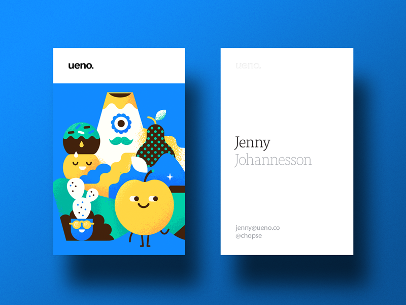
2. Use visual hierarchy to your advantage
Visual hierarchy refers to arranging your information from most important to least important. You can do this through the use of font size, color, and where you place your information on the design itself.

As we can see with these business card designs by Renga and Luis Rodriguez Carmas both have used font type and size to immediately draw your eyes to the names of the companies first.
When thinking about the visual hierarchy you would like to use in your own business card design, it’s important to think about the information you want to highlight most, and then work your way backwards.
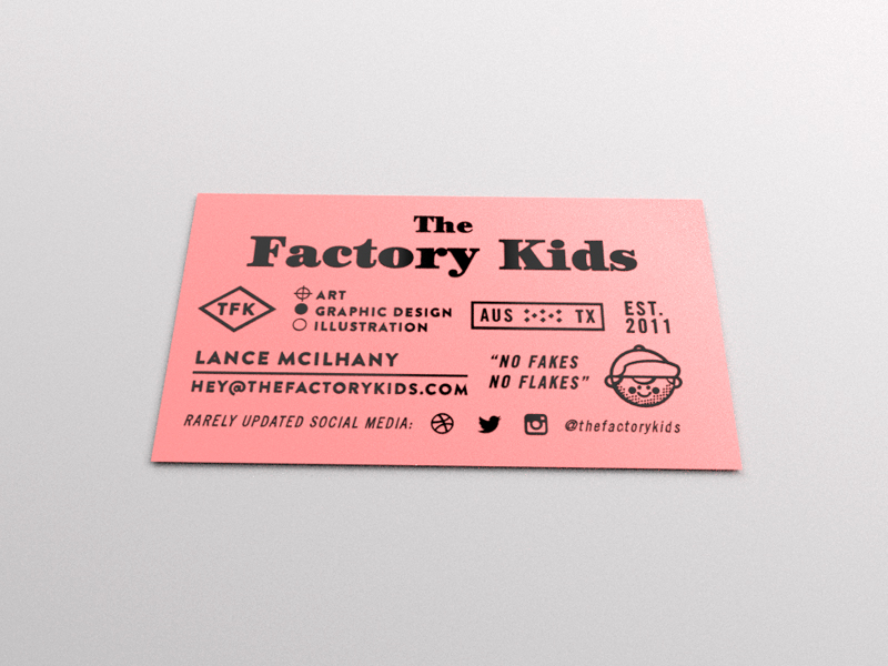
3. Add your personality to the design
Now that you’ve got your business-card basics sorted, you can start to think about how to do add your personality to it.
If you work for a business, this often means incorporating your brand colors, fonts, and logo design (often found in the company brand kit). If you work for yourself, you can use the principles of color psychology to think about the type of mood and feeling you want your business card to communicate. You can employ this same strategy with the fonts and other visual elements you choose to add into your design.
Design tip: When choosing a color palette to work with, experts suggest sticking to 2-3 colors. This helps create a unified design that won’t leave your design looking cluttered.

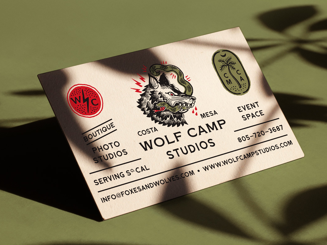
4. Keep the important information relevant
Just because the humble business card is one of the oldest forms of branding and marketing, that doesn’t mean it can’t be relevant and modern! If your business has a strong (or growing) web presence that you’d like to show-off you can easily incorporate it on the back of your business card by using social media icons and social media handles.
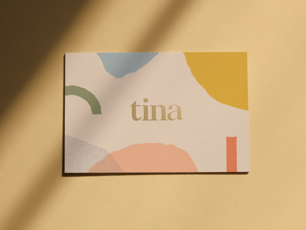
5. Use white space to your advantage
The truth is, there’s not a lot of real estate on your business card. Designed to be easily slipped into a wallet or pocket, it can be tempting to use every centimeter of space available to you.
However, one important principle in graphic design which is extremely relevant to business card design is the use of white space.
White space is the space on a design that is left blank. While this can seem unimportant, white space allows the other design elements on your page to stand out.

In these design examples above, we can see how white space has been used to create contrast and visual interest. While both incorporate bold photography, the text on the business cards are minimal and allow for the business card to breathe.
Now that you know how to design a high-quality, professional business card, have fun experimenting with custom die-cut shapes or embossing to add an extra layer of interest! For business card design inspiration, check out the #businesscard tag on Dribbble!

About the author:
Nicole Singh is a content writer, editor, and strategist (read: she loves telling stories). Nicole currently works as the content editor for Canva, a graphic design tool built for the non-designer.
Find more Process stories on our blog Courtside. Have a suggestion? Contact stories@dribbble.com.


