Learn the most common mistakes junior UX designers make when crafting their UX portfolios and how to avoid them.
Our friends at Designlab have a ton of experience guiding design students through the portfolio-building process. Read on to learn the most common mistakes junior UX designers make when crafting their portfolios and how to avoid them.
A portfolio site is a place to display your work online. So far, pretty straightforward. But if you’ve ever tried updating your design portfolio, you know that the decisions involved can quickly get overwhelming. What’s more, the stakes are high—get those decisions right, and they can land you a job. Get them wrong, and you might be passed by.
Based on our experience of guiding students through the UX portfolio process at Designlab, in this post we’re sharing some common mistakes found in junior design portfolios. Feel free to treat this as a checklist the next time you’re working on your site!
Mistake 1: Forgetting the user
It’s easy to forget that your portfolio site is a UX design project in its own right . Your site will need to serve a number of user groups, with specific goals and content needs.
Common user groups are hiring managers, recruiters, and potential freelance clients, though these will vary depending on your area of specialization, and the seniority of the roles you’re targeting.
Empathize with the situations your users are likely to be in. For example, managers are likely to have dozens or even hundreds of resumes and portfolios to review in a limited time. Making your site easy to navigate shows respect towards those users, and says something important about your values as a designer.
Also, consider some competitor research. Find the portfolios of other designers in your area of the industry, and analyze the strengths and weaknesses of how they solved the portfolio design problem.
Mistake 2: Showing too much work
Having a portfolio stuffed with 15 or 20 projects is generally a bad look. As well as being overwhelming for the user, it probably means that you’re showing a mixture of your best work, and your“it’s-okay”work.
“A portfolio is for showing only your best work.”
A portfolio is for showing only your best work. Score each project out of 10. If anything gets less than nine out of ten, cut it. Another way of thinking about curation is to consider each project and ask,“If a website visitor clicked on only one project, would I be happy for it to be this one?”
Mistake 3: Showing too little work
This can be a difficulty when first entering the industry. Most graduates from UX design courses have three or four in-depth projects from their studies.
However, unless this work is truly exceptional, portfolios with only student work can still feel a little thin. Look for ways to add depth to your portfolio, and aim to get your project count up to five or six portfolio-quality projects by including personal projects, freelance, and pro-bono work.
Mistake 4: Too much narrative
Most of the time, very in-depth written content is too much for junior roles. There are some fantastic examples of in-depth case studies on more senior designers’ sites—for example, Michael Evensen’s Soundcloud write-up and Simon Pan’s work with Uber —but this content works because it matches how substantial the project is.
As a general rule of thumb, use the minimum number of words required to communicate the necessary information about the design problem and the process you followed.
Mistake 5: Too little narrative
It’s possible to go to the other extreme, and include no storytelling about the projects in your portfolio. The problem with this approach is that it asks the user to understand your project through final images alone.
“Aim for around 300-400 words of narrative for each project.”
Your audience also wants to understand the steps that led to that solution: how you went about defining and solving the design problem, what challenges you overcame, and, ideally, what the results of the work were in business terms.
Create a story around your work by including some process images, like sketches, research documents, and wireframes. Also add concise, informative passages of narrative text that walk the user through the project. Aim for around 300-400 words of narrative for each project, clearly structured with headings and bullet points.
Mistake 6: Lack of clarity about your project role
Most professional design work is collaborative in some way, and it’s unlikely that you were responsible for 100% of the work on a project. Be open and transparent about how you contributed to the project. This is also an opportunity to explain how you communicated and collaborated with the rest of the team, and how your contribution is evident in the final results.
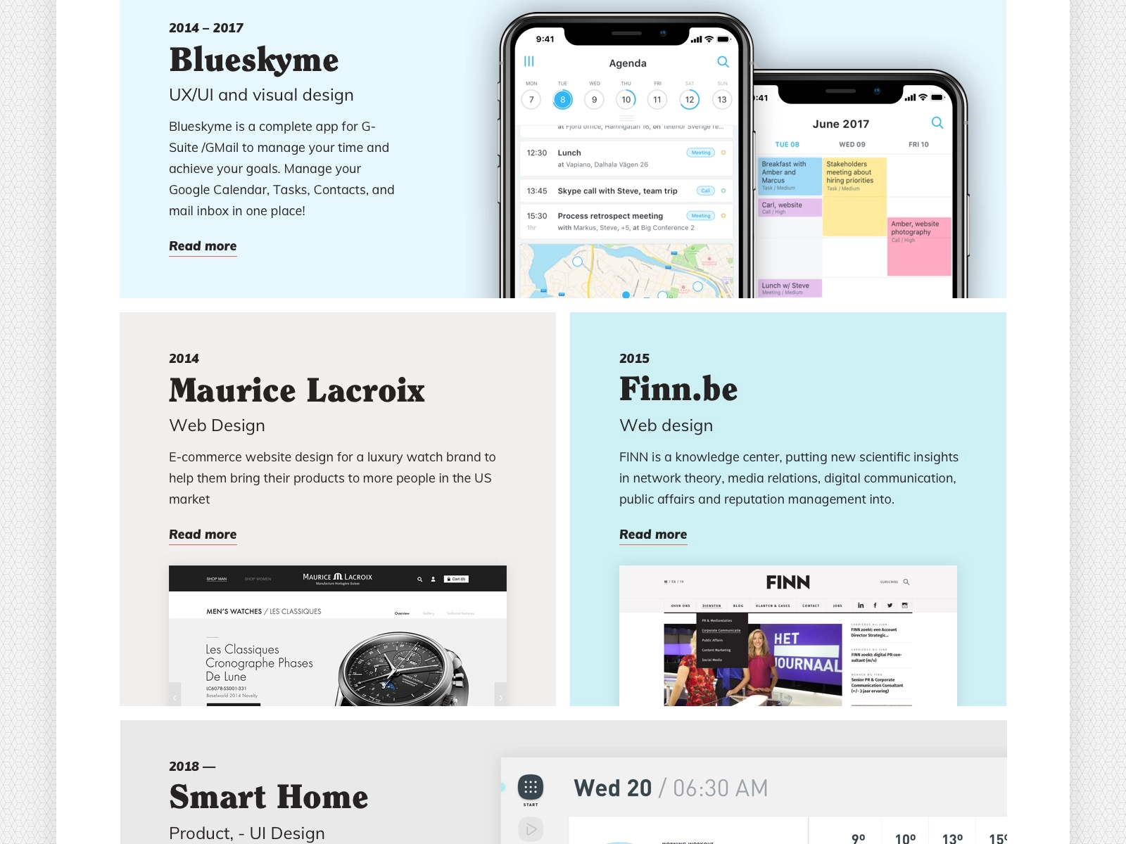
Mistake 7: Using generic images
A red flag in any portfolio is generic photography on the homepage—particularly open roads or tidy desks with a MacBook, a notepad, and a mug of coffee.
You may only have a few seconds to connect with the user before they close your website again—first impressions count, so don’t waste the opportunity to make an impact. Make any images you use meaningful—avoid photos of post-it notes on a wall when that content doesn’t add anything substantial to the narrative around your work.
“You may only have a few seconds to connect with the user before they close your website again.”
If you’re using mockups to add depth to your portfolio, make sure to use high-quality templates. It’s worth paying a bit of money for these: they’ll reduce the chances that the same template is being used by many other designers. It’ll also enable you to have a consistent set of mockups that help to unify your portfolio visually.
Mistake 8: Thumbnails that are too small
Your work might be wonderful, but if the user has to click on tiny thumbnail images to get there, they might never see it. The job of a thumbnail is to show off the content just enough so that the user is curious to see more. Unusable thumbnails may have the opposite effect, and cause people to bounce away from your site before exploring.

Mistake 9: Low-res or too-large images
Getting image resolution and file size right can be tricky, particularly if you’re including a lot of images on a single page.
Ideally, establish the largest size that your image needs to appear on your site. For example, if your template is 960 pixels wide at viewport size, you’ll want to save out images at retina (2x) resolution. So you’ll need image files that are 1920 pixels wide so that they’ll appear sharp on retina screens.
Keep in mind when images are at retina resolution, files can start to get very large. As a rule, ensure that no image is larger than 1 megabyte in size. But ideally, try to keep most of them below 500 kilobytes each. Here are some tips to reduce file size at high resolution:
- Use JPG format for any image that contains significant areas of photographic content.
- Use PNG format for any image that contains web graphics with large areas of flat color.
- When using JPG format, experiment with reducing the quality level down from 12 to 8, 9, or 10. Often there is no noticeable degradation in visual quality, but significant savings in file size.
Mistake 10: Typos—including typos in mockups
Recruiters and hiring managers often look for attention to detail above other qualities. Having typos or formatting errors on your site—or, worse, having them in your project mockups—can be a big turn-off. After all, if you’re not conscientious about the details in your own portfolio, why should they trust you with project work?
Mistake 11: Clichéd homepage intro text
A simple statement of what your name is and what you do is fine. But avoid anything that includes the words “unicorn”, “ninja”, and “wizard”.
Mistake 12: Dull, generic typefaces
Overused typefaces will make your work feel dull and generic, even if it’s not. Here are a few to look out for, and some suggestions for alternatives:
- Avenir/Avenir Next ➡ Nunito
- Arial ➡ Open Sans, IBM Plex Sans
- Helvetica/Helvetica Neue ➡ Open Sans, IBM Plex Sans
- Playfair Display ➡ Bodoni
- DIN ➡ Roboto
- Futura ➡ Didact Gothic
- Gill Sans ➡ Cabin
- Montserrat ➡ Metropolis
- Raleway ➡ Metropolis
Mistake 13: Poor responsive experience
Don’t assume that people will be accessing your site on desktop. Any of your users might be reviewing your site on the move, so make the mobile experience simple and usable. One trick is to use square (or even slightly portrait) images on your site. This will maximize the size at which your work can be viewed on a smartphone.

Mistake 14: Making your template too complex
Tobias van Schneider likens a good portfolio to a gallery —it should be a neutral space that allows people to focus on the work itself. Most of the time with contemporary digital design, that means keeping things pretty simple and minimal.
Mistake 15: No call-to-action
What do you want people to do? Contact you? Then give them a way to do it, and visually guide them towards that action—perhaps with a prominent “Get in touch” button. Having an easily downloadable one-page resume can also make it much easier for people to remember you and follow up if they’re interested in hiring you.
Links to your Dribbble, LinkedIn, and professional Instagram account can also help keep you connected with visitors who appreciated your work.
Avoid these common junior UX designer portfolio mistakes
Put your best foot forward in front of hiring managers by avoiding these common UX portfolio mistakes at all costs. Use these tips to create a professional, Junior UX designer portfolio that helps you land new opportunities and grow your career in user experience design. Good luck!


