

The field of Design is ever-evolving which means the way designers work continues to change. With that comes new terms, methodologies, and systems that aim to make workflows more efficient and to leverage products overall. A Design System is no exception to this—it’s a relatively new approach companies have started to invest in as they aim to create more cohesive user experiences and streamline their internal design processes or design language.
So, what is a Design System? If you’ve already researched the term amongst other design principles, you may have noticed a few varying definitions floating around the web. At a basic level, a majority of those sources agree that a Design System is a cohesive set of reusable components of visual design, UX design, and UI components representing a brand’s language, serving as an overarching guide for a team to follow as they develop their product(s).
However, we thought we’d gain a much better understanding by examining real-life examples of design systems them in use—from real companies with real UX design teams developing their brand’s design language. We looked to our community and noticed many companies have robust Design Systems established for themselves. We asked five of these leading development teams to tell us about their Design System and share what they believe makes an effective one. If you’re thinking about whether or not a Design System is worth investing in, you’ll want to read what they had to say:
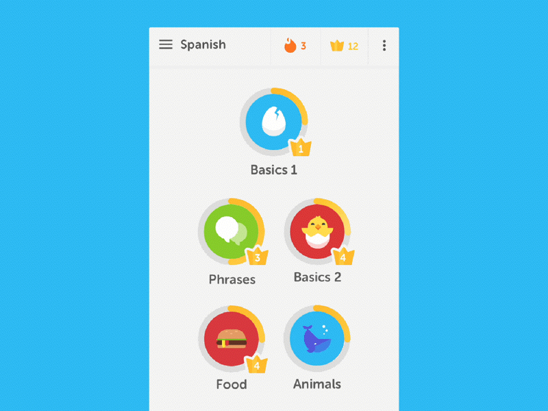
Duolingo
Duolingo is a free language-learning application with a game-like experience where users earn points for correct answers, race against the clock, and level up. Designer Jack Morgan helped the DuoLingo team build the first version of their Design System, the Duolingo Design System (DDS) in late 2017. Jack shares more on the process and what makes an effective Design System below:
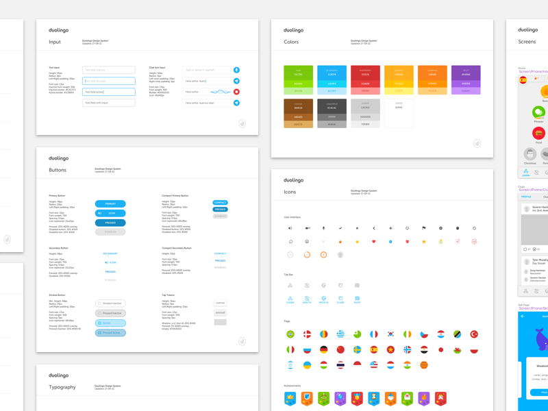


An effective Design System should first and foremost do three things: 1. Reduce inconsistencies, 2. Increase designer/engineer productivity, and 3. Evolve; Design Systems are in “permanent beta”, and should adapt and change to meet the needs of your users, designers, and engineers. A Design System should not stop at design but should be as beloved by your team’s engineers and product managers as it is your design team. While your Design System may begin as a glorified UI Kit, that’s only the first step—it should eventually become a beautiful duet of design and code.
The Duolingo Design System was our first ever attempt at creating a shared library for Duolingo’s visual language. Corporate brand identity is my original specialty, but for many of today’s startups and technology companies, their UI actually is their brand identity—so I combined my branding expertise with my love of detailed systems design to create the Duolingo Design System (DDS), with the initial goal of allowing designers at Duolingo to build in 60 seconds screens that would’ve taken 10 minutes before, all without restricting creativity. When building any digital product, I focus on creating modular, pattern-led designs that can scale from 100 users to a billion.
Opendoor
Opendoor is an online platform that takes the hassle out of buying and selling homes. The design team at Opendoor has built a beautiful cohesive system and their designer Nicolas Solerieu shares a few words on it below:


An effective design system strikes a balance between general and specific. If the system is way too general, it becomes abstract and impossible to apply. If it’s too specific it becomes restrictive and limiting.
At Opendoor we first focused on building a system that’s scalable. We’re launching new markets left and right, and we’re always evolving our product offerings, so we need to ensure that the system we created doesn’t break or become unwieldy as we grow. We’re also very focused on usability. We broke down the things that make us Opendoor into practical applications wherever we could. For color, that meant indicating the ideal ratios of our brand colors in our work. For writing, that meant explaining how and when it was okay to deviate from the core brand voice.
If there’s one thing we’ve learned from the process, it’s that no design system is truly final, especially in a company that is evolving so quickly. The reality is that we’re constantly reinventing the way we express our brand. At a high level, our system is broken down into logo and symbol best practices, typography, color, voice and tone, photography, illustration, and motion. Keep an eye on our Dribbble to see more!
MessageBird
MessageBird is a telecom company offering advanced APIs and user-friendly interfaces for SMS, voice calls, and chat. Their designer Michelly Sugui who worked on their newest Design System takes us behind the scenes and shares some best practices:


An effective Design System really depends on your goals. On the MessageBird product team, we like the idea of a Design System being about the people using it, acting as more than just a set of components, but as a tool serving people’s sanity when creating other products. When scaling and developing teams, it can be easy to get lost and end up with a set of products that look like they come from another brand, usually causing a lot of back-and-forth work. Having a solid Design System helps you ship consistent experiences.
A good place to start is asking your team for feedback. Maybe the front-end team is spending a lot of time building new components, or maybe the design team is spending too much time doubting the placement of components resulting in less time for research and discovery. Either way, a Design System should eliminate part of the guesswork on how to build new products and features, empower those using it to be more focused on the core experience and of course, let’s not forget the playfulness of it! It’s important to have fun with it as well.
In this post there are some questions that act as starting points. After hours of research and discussions, our team decided to divide our Design System into four libraries. The first one is the Global Library—the base of everything holding the atoms and molecules like colors, input fields, toasters, notifications, and everything that appears in all the products. The secondary ones are specific libraries for marketing pages, the dashboard, and one for the Flow Builder. It’s still a work in progress, and we’ve started to consolidate it more as we’ve added more designers to our team. We are a team of six and as we grow we need to ensure everyone is able to deliver consistent experiences and that the visual language in MessageBird is perceived the way we intend.
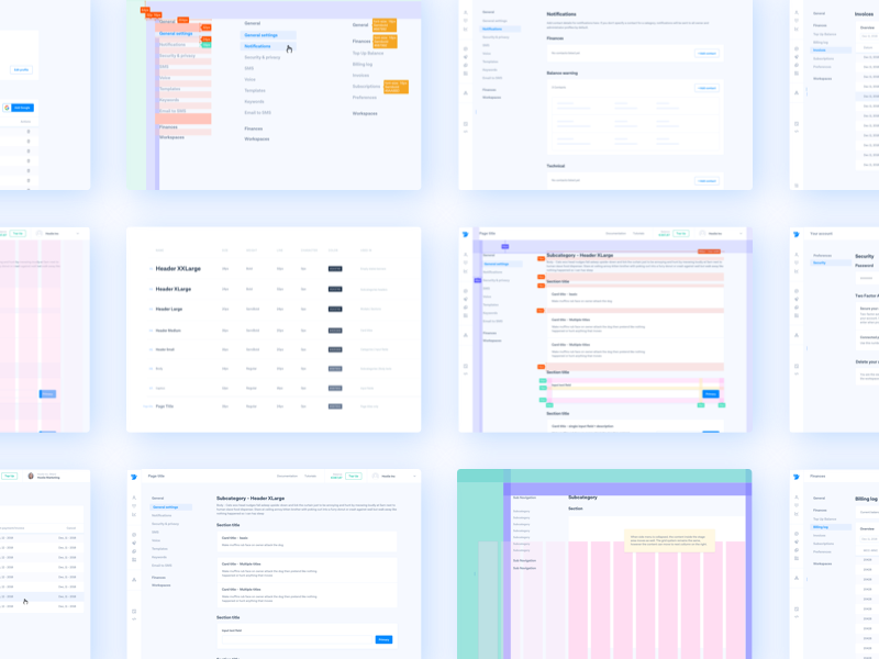
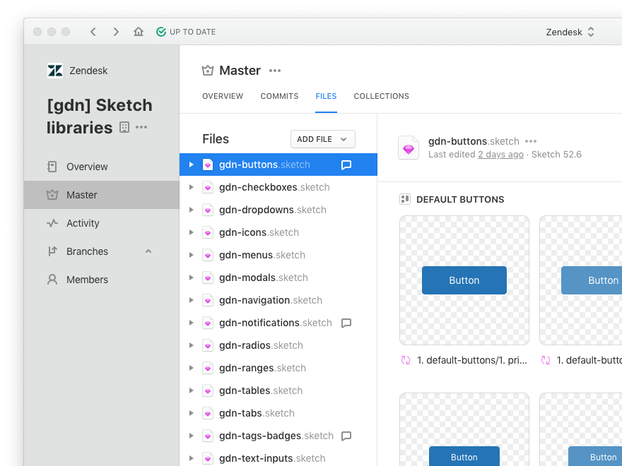
Zendesk
Zendesk is a beautifully designed customer service and engagement platform aiming to make better experiences for agents, admins, and customers. Product Designer Alison Shaw leads design systems at Zendesk and shares a few words on their system, Garden, and how a Design System should help both your internal team just as well as your end-users:


A good Design System is a collaboration tool for designers and developers, but it also needs to benefit the end-user. Design systems should solve easy problems, and hard-but-common problems, so that the designers and engineers who use the system can focus on the more fun and challenging aspects of their jobs. For internal audiences, Design Systems should increase designer and developer efficiency and result in a more polished final product. End-users will benefit from well designed and engineered components and the added consistency.
Zendesk Garden is an open-source Design System. It helps power all of Zendesk’s products and embodies our company’s “beautifully simple” ethos. We build our components to the highest standards in all areas: visual and interaction design, motion, and engineering—and everything we make has accessibility features built-in. We love the fussy bits, and I think it shows in the care and love we take in cultivating Garden.
Heartbeat Agency
Heartbeat is a design agency that helps digital product teams in fin-tech create top notch experiences. They’ve just built out the first version of their Design System, .pulse, and Product Manager Dima Lepyokhin shares a few words on why:
For the last few years, our team has found ourselves fighting over things like pixels, styles, and spacings with CMOs and digital Product Owners. As a result, what usually happens after the development work of a product is it ends up looking very different than what we originally intended to create: The DRY principle is abandoned, UI elements appear inconsistent, etc… This can be extremely frustrating after all of the hard work that goes into designing a Product.
We found these issues were likely a result of the lack of documentation and consistent vision around design-related assets. A Design System would help us improve this situation—but in order for a Design System to be effective, we realize it would need to:
- Cover a wide range of processes, from front-end to sales.
- Help a Product look consistent.
- Minimize guessing and shorten any decision-making process.
- Help onboard new team members more quickly.
- For larger teams, help everyone to communicate using the same language and to do their best in the context of the team’s best.
We believe that an effective Design System is shared and approved among all internal teams and also regularly fine-tuned. We’ve created .pulse to outline principles, values, and other small but essential things. One of our core values is “Be creative but stay accountable”, and we believe that .pulse helps us strengthen the accountability part—as anything not properly described cannot be improved!
Takeaways
Now that we have a better understanding of what defines a Design System, let’s review the main takeaways of what makes them actually useful. An effective Design System should:
- Be scalable: As your team continues to grow and your product evolves with time, so will your Design System and its component library.
- Take your team’s feedback into account: A Design System should ultimately serve your team and help streamline their processes—eliminating any guesswork around how to build new products and features.
- Benefit the end-user: Your Design System should help your internal team—through style guides, pattern libraries, or UX design guidelines—but also benefit your product’s users through a well-designed and consistent experience.
- Be non-constraining: Design a system that strikes a balance between general and specific so it’s neither too abstract nor too restrictive in application.
- Be regularly be fine-tuned while representing and supporting your company’s core values in a visually cohesive way.
If you’re interested in learning about more design terminology, make sure to check out our other posts in the series What is UX Design, What is UI Design, and What is Product Design and stay tuned for more coming soon!
Find more Community stories on our blog Courtside. Have a suggestion? Contact stories@dribbble.com.


