

Who are you?
I’m Maxime Bourgeois, a Montreal-based full-time freelance illustrator and designer. I’m also a video game nerd, TV connoisseur, and podcast fanatic. Empowered by the Dribbble platform, I’ve been living the dream of doodling in my underwear all day long for the past year and a half!
What are you working on?
Mostly illustrations, probably isometric, for mobile apps and tech companies. I make a lot of hero images and brandin icons. Recently, I’ve also been helping egghead.io and Maggie Appleton with some illustrations for their awesome coding courses. Don’t tell her, but working with Maggie has kind of been a dream of mine ever since I discovered her existence. Like, have you seen her work? This girl is going places.
I’m also brainstorming ideas about starting my own online shop. No concrete ideas yet, but it’s going to be geeky! Keep your eyes out!
Choose a favorite shot of yours. Why is it a favorite?
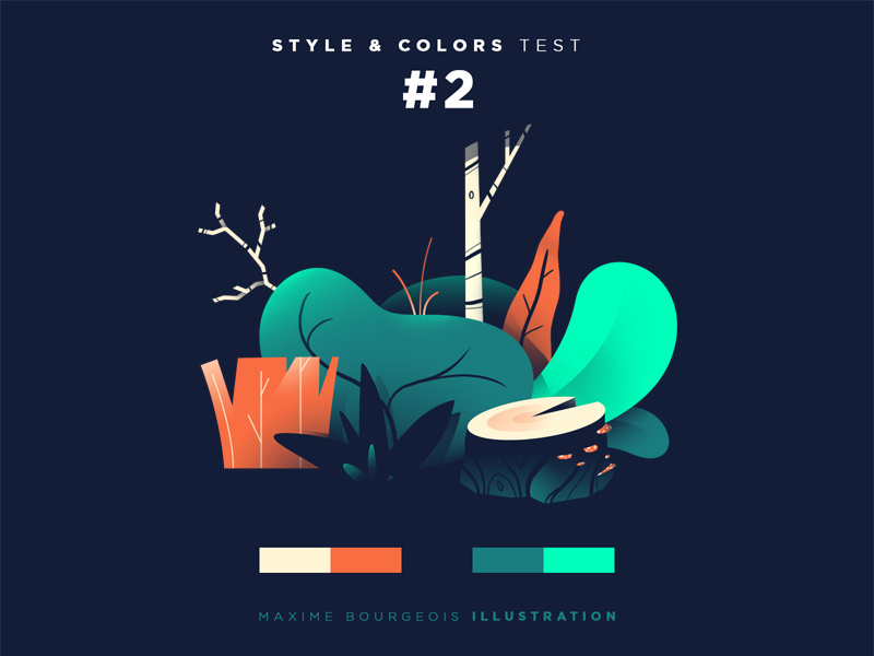
Style and Colors is a little series I started while I was job hunting. I knew I wanted to steer my career toward a more illustrative future, but I didn’t think my skills were diverse enough yet. So, I started drawing stuff I didn’t necessarily felt comfortable rendering. It was a really great way to find my voice, to identify my own niche. This is my favorite from that bunch— plants are always a blast to draw!
To my surprise, this little series brought me a couple of work inquiries! One thing leads to another and I gave that whole freelance thing a try. What was merely meant to be a style exercise pretty much kick-started my entire freelance career.
Tell us about your setup. What tools did you use to create the shot (e.g. hardware, software, pens, paper, blowtorch)?
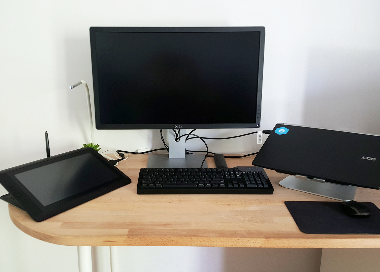
I work from my very modest living room desk, where my Cintiq, sketchbook, Acer laptop and 4k display barely have enough space to sit. This setup has served me well so far, but I would definitely like to make myself more of a proper office once I move to a bigger place.
I generally start by sketching rough ideas in my sketchbook with simple pencils and markers. This is to get a good composition before jumping into the digital word. I generally don’t even bother scanning them onto my computer because they’re very crude. I prefer Photoshop’s organic workflow over the more mathematical approach that comes with Illustrator, and I start in there with establishing a color palette. I tend to stick to 5 main colors, and coolors.co is a great tool to find them. From there, I lay down the main shapes until I’m happy with the composition and then I add details with gradients and custom textures using my Cintiq.
I have also been dabbling in After Effects recently, since motion design is something I’d like to branch to at some point.
Choose a favorite shot from another Player. Why do you dig it?

This is a very hard question, and my answer would differ from day to day. But today, I’m going with this shot by Christopher Reath. It captures exactly how I believe illustrations should be integrated into a design. It merges perfectly with the rest of the website and feels like part of the whole experience, not just a cool illustration off on it’s own.
I also have to give honorable mentions to Brian Edward Miller, Andrew Nye, James Gilleard, Maggie Appleton, Kevin Yang, and Romain Trystram— who could easily have posted my favorite shot on a different day.
Find Maxime on Dribbble, Instagram, and Twitter.
Find more Interviews stories on our blog Courtside. Have a suggestion? Contact stories@dribbble.com.


