Timeouts are lightning-quick interviews. Five questions to help you get to know the players holding court at Dribbble. Many thanks to Ken for being today’s interviewee.
Who are you? Let us know where you hail from and what you do.
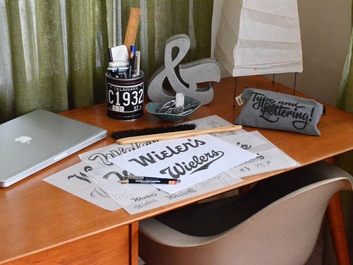
![]() I’m a type director, typeface designer and letterer at design studio and type foundry House Industries, located in the bustling hamlet of Yorklyn, Delaware. I’m also a partner of Photo-Lettering, Inc., an online letter-vending-service-turned-iPhone-app. When I’m not drawing letters, you can find me teaching at Maryland Institute College of Art and The Cooper Union, or lecturing on the topics of lettering and typography. Occasionally, I find time to update typeandlettering.com, an online resource originally created for students and attendees of the workshops I frequently conduct.
I’m a type director, typeface designer and letterer at design studio and type foundry House Industries, located in the bustling hamlet of Yorklyn, Delaware. I’m also a partner of Photo-Lettering, Inc., an online letter-vending-service-turned-iPhone-app. When I’m not drawing letters, you can find me teaching at Maryland Institute College of Art and The Cooper Union, or lecturing on the topics of lettering and typography. Occasionally, I find time to update typeandlettering.com, an online resource originally created for students and attendees of the workshops I frequently conduct.
What are you working on?
I always seem to have a bunch of irons in the fire. At the moment, I’m directing the development of a few typefaces for House, in addition to plugging away at a personal font project that’s loosely inspired by 19th-century French stencils. On my downtime, I’ve been working on apparel designs and in-store lettering for House Industries’ new showroom and gallery scheduled to open by the end of 2013.
During my free time lately, I’ve been keeping myself busy drawing a logo for a friend’s new online cycling shop, contributing to the forthcoming publication of Finnish comic book artists Christoffer and Kaisa Leka, and designing an identity for my wife’s latest venture: New Sweden Vintage.
Choose a favorite shot of yours. Why is it a favorite?
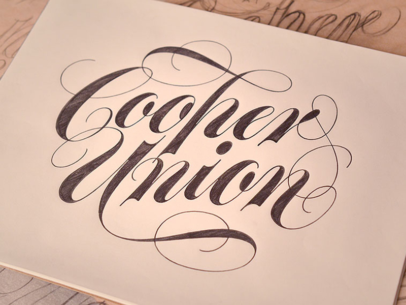
My favorite project is usually the one I’m currently working on, while my least favorite is the one I just finished. That being said, I don’t entirely loathe the Cooper Union sketch that I recently drew to advertise my regular workshops at the school. (Granted, I still think that the mark could use some tweaks, but that’s probably better left for vectorizing.) The self-initiated piece did give me an excuse to spend more time with the work of some of my favorite artists, such as Tom Carnese and Tony DiSpigna. And, since I often use my work as an opportunity to discuss reference material and historical sources, I was especially pleased that the shot generated some stimulating dialogue on Dribbble and elsewhere. Cara DiEdwardo, a talented calligrapher and coordinator for Cooper Union’s typeface design program, even asked about adopting the design for use by the school.
Tell us about your setup. What tools did you use to create the shot (e.g. hardware, software, pens, paper, blowtorch)?

As much as I’d like to work a blowtorch into my routine, I tend to keep things pretty low tech when it comes to drawing. During the initial sketch phase I usually work out roughs on standard tracing paper using a good ol’ No. 2 pencil. Occasionally, when I’m too lazy to reach for a sharpener, I’ll pick up my Pentel Graph Gear 500 mechanical pencil with 0.7 mm HB graphite. Creating a physical artifact is one of the most personally fulfilling aspects of lettering, so it’s not uncommon for me to render a tight comp on Bienfang Graphics 360 rag marker paper as I did here.
Choose a favorite shot from another Player. Why do you dig it?
While it’s easy to get seduced by the highly flourished scripts, intricately detailed logotypes and other complex wordmarks that are being cranked out these days, you can never underestimate the beauty, power and simplicity of a skillfully drawn letter. All of Kris Sowersby’s work is so thoughtfully considered and well resolved that it’s hard to choose a favorite among his many brilliant pieces. Push come to shove, I’d have to choose the bold-yet-sexy Domaine Display ampersand. Not only does it have impossibly smooth and enviable curves, but it’s only one glyph in an equally impeccably drawn 46-style font family—no small accomplishment.
Find Ken at Dribbble, on Twitter, and at Type and Lettering.
Find more Interviews stories on our blog Courtside. Have a suggestion? Contact stories@dribbble.com.


