Timeouts are lightning-quick interviews. Five questions to help you get to know the players holding court at Dribbble. Many thanks to Jacqui for being today’s interviewee.
Who are you? Let us know where you hail from and what you do.
![]() My name is Jacqui Oakley and I’ve been illustrating for over ten years now mainly doing editorial illustrations but now I find myself doing more and more hand-lettering, which is a fun addition.
My name is Jacqui Oakley and I’ve been illustrating for over ten years now mainly doing editorial illustrations but now I find myself doing more and more hand-lettering, which is a fun addition.
I was born in Canada, but spent my formative years in Bahrain, Zambia, Libya and England which left me with the odd accent I have today. I also teach at OCAD University (Ontario College of Art and Design) in Toronto but I live in Hamilton. If you don’t know, this is the steel city right next to Toronto which is affectionately known as “The Hammer”.
What are you working on?
Just finished a group art show entitled ZOO. It was great to spend the time on larger detailed paintings and collaborate with talented friends. I’m also gearing up to work on my first children’s book. In addition, I’ve been invited to do art for La Carnita, the pop-up art and taco shop in Toronto at the end of September. Anytime I can get free tacos by doing art I’m game.
Choose a favorite shot of yours. Tell us why it’s a favorite.
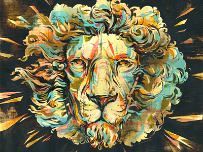
I guess it would have to be my Lion painting which was the cover art for the Two Crown King album.
I usually get hired to do ‘pretty’ work which is fun but it was enjoyable to do something more intense. I’ve always been into Horror and sci-fi so it’s nice to start bringing some of these influences into my work. I’m also used to working on magazines which can be disposable so working on a product that people will actually hang on to is satisfying. On top of all that, it was also the first time I collaborated with my husband Jamie Lawson from Poly (and amazingly we didn’t kill each other in the process). I was so pleased by the combination of our work.
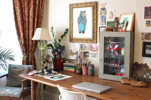
Tell us about your setup. What tools did you use to create the shot(s)?
I usually collect way too much reference/inspirational material online or in books for my pencil sketches. Then I typically ink my work and paint with good old-fashioned oil or acrylic and elbow grease. I work with layers of paint, dry brushing & ink line-work on textured paper to get an aged feel. I’m a sucker for a ‘vintage’ look. I’m no stranger to the computer though, sometimes I do add colour digitally, but I always tend to enjoy the happy accidents you get when working by hand.

Choose a favorite shot from another player. Tell us why you dig it.
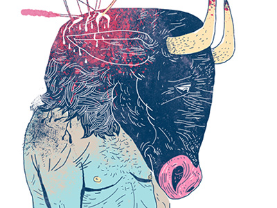
It’s so hard to choose. One would have to be Dushan Milic's Minotaur piece. He’s always been a great artist but lately his line-work and sense of colour is so sensitive but so quirky & original. This piece illustrates such a weird combination of humour and melancholy, and those lines…!
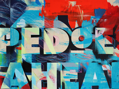
At the risk of being accused of nepotism I’m going to have to also choose one of Jamie's pieces, Damn the Torpedoes - panel 3.
This is a massive 72 × 36” piece in acrylic paint and ink. Love how these pieces play with depth & how the layers push & pull against each other. Quite a puzzle to figure out which layer of paint came first. It’s hard not to pick one of his pieces since we’ve been influencing with each other so much this year.
And finally my third pick would be An Object of Beauty by Darren Booth. As you can see from my last pick I’m a sucker for the imperfections of hand-painted lettering. I always love Darren’s script but there was such a beautiful simplicity to this piece that made it really stand out.
Find more Community stories on our blog Courtside. Have a suggestion? Contact stories@dribbble.com.


