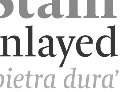
It’s that time of the year again, kids. I’ve been putting together another tidy batch of Typostrophe schwag for TypeCon and beyond. This year’s buttony goodness features one of my all time favourite italic text faces — ITC Century Book —...
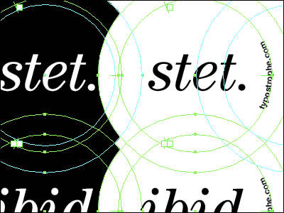
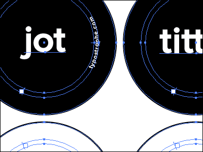
Preparing a little bit of last minute Typostrophe schwag for a few dozen lucky TypeCon peeps. The fuss budget in me is using Mark Simonson’s tidy Proxima Nova with more than just a touch of manual kerning.
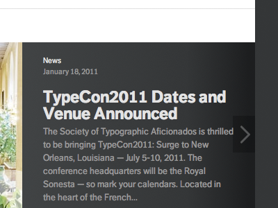
Wrestling a WordPress theme and its heinous pile of CSS selectors into submission for the reskinned TypeCon site. This is my first attempt at mashing a bit of typographic finesse into the news item “slideshow” on the home page. The typef...
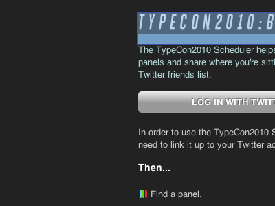
I’ve been working with the fine folks at Weightshift, adapting and configifying their nifty SitBy.Us app for use during this summer’s TypeCon. Now, if we just had a schedule to plug into this thing.
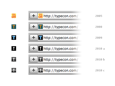
Here are the favicons from some previous TypeCon site incarnations, compared with three variations pulled from my previous shot.
I’ve stuck with the plain square shape without the single pixel, rounded corners. I’ve also chosen the thin...
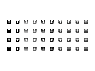
Freshening up the favicon for the TypeCon site, while tying in the current branding and monochromatic palette. I’m trying to keep it fairly minimal and absolutely pixelclean™ …
Updating (and tidying) the logo grid for the TypeCon site … which unfortunately is a rather painful hodgepodge of PHP, Wordpress, and Mediawiki hooks … all dunked in a pot full of steaming <div>, <table>, and inline style soup.