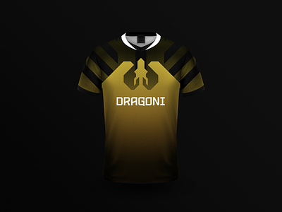
Dragoni Jersey

One logo version in particular was quite polarizing among the team. It was simple, bold, and very geometrical. It wasn't at all what they were expecting and as with many clients the vocabulary used to express these frustrations varied so much. It was hard for me to target the core frustrations as I knew this concept was promising. I also knew that the team couldn't quite express what they didn't see in it.
It was when I went away to tweak the logo slightly and generate assets to show how it would be used in the wild that it clicked. This jersey is one of those assets I created. Ultimately this concept became the final version that we iterated on.
The way the silhouette from the dragon is used here showed the team how their icon was a strong symbol that they could lean on in various brand assets.