SAUR
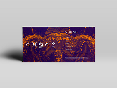
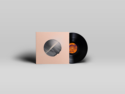
SAUR is an experimental rock band from Lisbon with whom we have worked for weeks to create the image of Amber, their first album. Known for the aggressiveness of their guitars, synthesizers and their themes, it was required that the whole image and communication would live up to the band’s image. The illustration rests only on an irregular shape of amber, represented centrally in an undefined space and time. And just as amber resin preserved flowers, insects, fruits and other plant specimens in perfect condition for centuries, this album also aims to immortalize the band’s values, consciousness and critical position by which it’s known since its foundation. In practical terms, the image works in two layers. The first, with the cover illustrating an exterior perspective of this form of amber; and the second, when exploring its interior and passing through a new dimension, both expressive and aesthetic. Simultaneously the typography, of alien and Aztec inspiration, was developed with the purpose of codifying messages that the band wanted to convey, in a manifesto written in other alphabets.
Hope you enjoy it and tell us what you think..
Fulle project here:
https://dribbble.com/shots/new?rebound=9883467-SAUR


