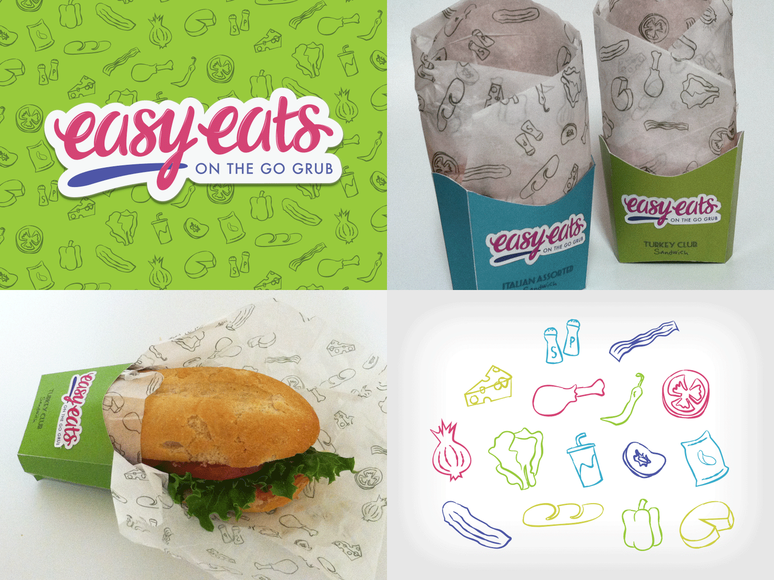
GIF! Easy Eats - fast food packaging
A quick packaging project exploration, with my partner Jeff Burrell, an Industrial Design student.
The logo was hand-lettered, and everything was designed/built custom for this project.
Problem:
To design a fast-food package that enhances user experience in addition to addressing the subject of sustainability. The package must also have a unique and consistent brand language that supports the design.
Context:
To address the mess and difficult eating conditions normally associated with fast food.
Target:
The target audience is young adults.
Solution:
User Experience
The package was designed in order to support on-the-go eating. The form of the sandwich sleeve was designed to enable eating cleanly with one hand (no matter the size of the hand). The hard cardstock provides support for the sandwich, contains all of the contents, and drastically decreases the likelihood of spills and drips. The shape and size of the sandwich sleeve also allows the sandwich to be placed upright in a cup holder when the user needs to use both hands. The sandwich wrapper was designed in such a way that the user can open it with a single pull so the user may immediately start to eat, which not only decreases the amount of time and hassle spent maneuvering the wrapper, but aids in maintaining the overall cleanliness of the meal as well.
The package as a whole is consistent with the current fast food trend of “fast casual” which is the idea of fast food, but in a healthier & more sophisticated manner. This is created with the healthier sandwich option, at a smaller portion, yet manageable for on-the-go eating.
Sustainability
The sandwich sleeve was manufactured from recyclable heavy-weight card stock and the sandwich wrapper was manufactured out of biodegradable rice paper. The cardstock “cups” stack orderly, and are efficient space and material savers. With the use of less material, and at a smaller size, price may be reduced.
Graphic Design
The “easy eats” logo follows the common fast food logo trend of bubbly cursive, with the use of bright bold colors. The sketchy illustration of icons is a common technique for the wrapping of sandwiches to show the many healthy parts to the sandwich. This style is what is currently trending in packaging design.


