


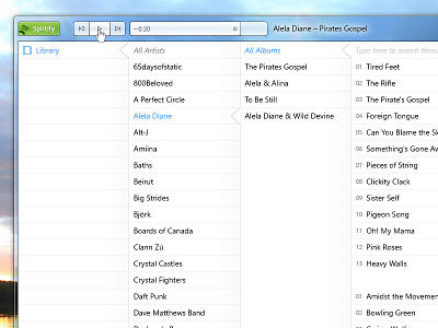
Spotify Redesign (Windows 7): Library


I love the idea of Spotify and other streaming services. What I hate about it though is the client. It should be super simple, music oriented app that you just want to use.
Meantime, when I give Spotify to my mum she wouldn't know what to do. I am getting lost there quite often so there is no surprise.
I decided to slowly redesign every aspect of Spotify clients. Starting with Windows 7 style. Trying to achieve consistency across all platforms but I think the app should fit overall system style, not forcing it's own.
There is far more thinking to this than just „making it pretty”. I thing Sotify needs some things to be cut, cause it overwhelms the user. The Library in this design would merge all the tracks you love in one place and gives the navigation for easy browsing.
I am aware that this won't be perfect. I don't know every decision behind current Spotify, but I think it would be better if it would be simpler. I am not planning to cut off what I can. Instead I want to make it smarter and more obvious to the user.
Also, I found it hard to figure out how to design something good looking for Windows as there is not so much nice apps here (even from Microsoft…). So it was a challenge.
The project will continue as I will try to change all parts of the client and then show how would it look like on other systems. Hope I will last this long. ;)