Simple credit card checkout

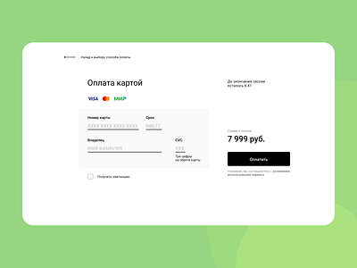
This time I've tried to make it as simple as it possible. Kinda almost bordering with a wireframe.
These forms usually look ugly and messy and confusing with too much details.
Here I want a user to be able to figure it out instantly and feel comfortable.
My intention for user was like this:
- at first the look slides to the header,
- then to the sum,
- then to the button where the action is written,
- and after this to the fields to be filled.
Kinda two quick eye movements:
1. one diagonal from top left corner to bottom right corner,
2. and another - from right to left.
I've tested it on one person and she said it works fine for her.
Hope, it may work well for other people as well.