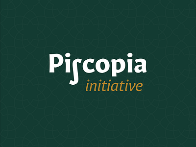
My first brand comission: Piscopia Initiative

Background:
* A group of women working towards their Phd in mathematics have founded a group called the Piscopia Initiative.
* Their mission is to inspire women doing mathematics undergrad to go on to do their PhD through support and providing positive role models. To create a more equitable balance of men/women.
* The name comes from Elena Cornaro Piscopia, the first woman to get a PhD, in 1678.
Brief:
* Preferably a logotype/word mark
* They like the idea of incorporating the integral symbol you see substituting the 'S'
* Should read 'Piscopia Initiative'
* Definitely not pink
* Symbolism around a network or link
Font choice
I've tried to use a typeface that acknowledges the past and looks to the future. Gitano Sans I think does that, it's a serif font that tries to be sans-serif. Respect for the past but an unconformist.
Pattern
The background pattern is inspired by Arabic geometry. Tying into mathematics, the origins of modern geometry, the integral symbol, and that sense of community forming a network.
The pattern will be used on printed materials and social media to give a sense of depth, a tool for the brand to use.
Palette
The palette wasn't specified apart from a suggestion of dark red. Having tried a few reds I came to the conclusion that it might set the wrong tone.
Their movement is a long term commitment, seeking natural progression. In the UK more than the US, green represents calmness, stoicism, and the natural environment. Red feels too angry, short-fused almost.
I think this is my first post too - been watching all the awesome stuff on here and the YouTube channel for a long time.