Adidas

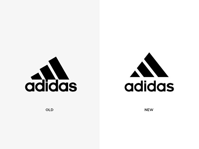
This was a fun warmup exercise I did for Adidas. I challenged myself to look at potential ways to improve the 3 stripe icon, while still keeping the integrity of the brand. Below are the changes I made for the refresh. Hope you all enjoy!
+ Using the stripes to distinctly define the “A.”
+ Refining angles and spacing of the stripes for a more balanced and pleasing appearance.
+ Adjusting spacing between the logotype and stripes.
+ Redrawing the “Adidas” font using basic geometric shapes as my guide.
+ Opening up the tracking of the logotype for better legibility and consistency.
+ Addressing size proportion of logotype to stripes for clearer continuity.