Association Youth wakes Varaždin logo

A project I did for an association called Youth wakes Varaždin (Croatian city). Association works on the development and empowerment of a sustainable tripartite relationship in order to raise the quality of life of young people in the City of Varaždin.
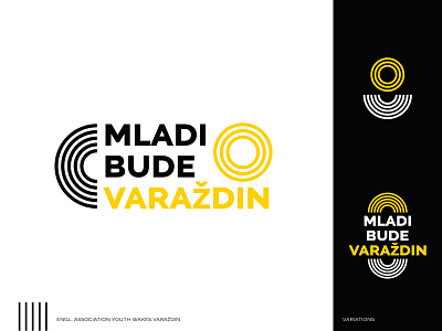
Since this project is about the activation of young people and raising of life quality, epicenter analogy came up as an interesting idea. So I've designed concentric circles that represent waking and activation of youth and yellow circles as a symbol of a new dawn for the city.
There are also many logo variations for different purposes, for example, avatar icon or podcast logo in a microphone shape.
Comments will be appreciated (likes too) (:
Dribbbling you soon!