New Personal Branding

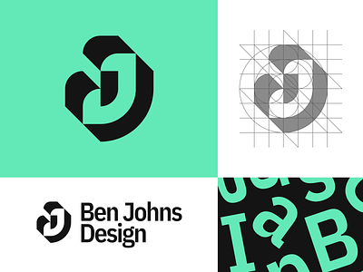
My old "J" logo was getting a bit out of date in my opinion, so I thought it was time for a refresh. On the upper right you can see the grid lines I used; all of the curved edges are from perfect circles. I paired it with a cool futuristic font and there you have it!
Let me know what you think!