Dental Logo

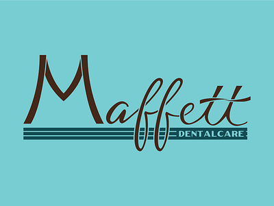
This two-color logo was done for a local dentist. The hand-lettered script is supported by a thicker, art-deco-style base. I really had fun with the small details: the twist on the double-Ts is reminiscent of floss, the M echoes a prominent Charleston bridge, and there is a subtle toothbrush metaphor along the length of the composition.
As I worked through the design, the pseudo-word 'Dentalcare' seemed keep coming up as a way to explain more about their business ethos than just using the word dental, so it was incorporated into the final design.