Brylcreem Improvements
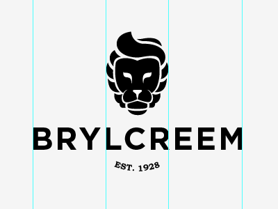
Further improvements to the Brylcreem logo, more defined facial lines to brake up the black and bolder type to fit with the lion mark. Arced 'est' is to give flow and brake up the ridged lines. Anyway hope you enjoy!
Further improvements to the Brylcreem logo, more defined facial lines to brake up the black and bolder type to fit with the lion mark. Arced 'est' is to give flow and brake up the ridged lines. Anyway hope you enjoy!