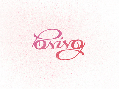
Posing Ambigram Logo
Working on an ambigram logo for a fashion related industry. I'm trying several versions to reach the perfect readability point, the N is very hard to achieve right now, I'm looking for some suggestions on how to make a better N here, notice that this one is suposed to read uppercase, but actually the entire type is lowercase (except P).
So my main problem here is how to make this N better, hope you liked the direction and have some nice tip to solve this. :))))
Thanks!
More by Breno Bitencourt View profile
Like


