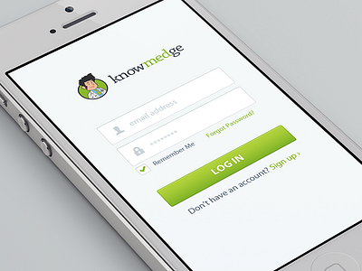
UX Tweak - Critique Pls!

Please view @2x and please critique. There are a couple very minor UX tweaks, but I feel that they're potentially very important in differentiating a typical login screen with a screen that's really paying attention to the details:
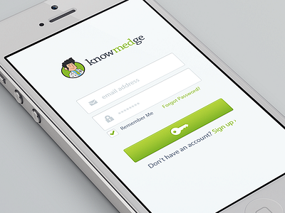
1. I changed the "user" icon to a "mail" icon because it has always required an email address and not a username.
2. I wanted to see what the button looks like with an icon instead of saying "log in". I feel like people already know that they're logging in, and I want a key (or some other icon) to replace the words "log in" the same way that magnifying glasses are on "search" buttons nowadays.
I intentionally made this exactly the same as the original shot so you can compare the difference.
What do you guys think? Good UX improvements? Lame?