Confirmation UX - behind the screens

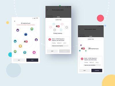

This is a classic example of how much effort goes into making good UX. This screen is shown to the user after they fill a complex form. Apart from seeking confirmation, this screen is also supposed to inform them that notifications will be sent to dozens of users immediately on posting. Although not a destructive action, it was an important part of sanity check to make sure they don't spam the system.
It took us hundreds of iterations to arrive on the final post confirmation screen which was in my previous shot. Adding some of the versions (make sure to view full screen) patiently attempted by @jekingala99 & @mandeepkundu.
***
I actually do a whole lot of UX & very little UI, so you might want to read the case studies on my portfolio instead. I occasionally post on Instagram & Twitter too. 🙂